

Diagonal lines are one of those design elements that web designers love and web developers fear. Breaking up the vertical lines in your page design adds variety to what would otherwise be a rigid grid. But there is a reason most website designs stick to perpendicular lines: the tools used to create layouts in the web browser were based around placing and styling rectangular blocks. Adding diagonals may seem straightforward on the surface, but it introduces a lot of complexity.
One common design element using diagonals is parallelogram-shaped images. Since the native boundary of an HTML img is always a rectangle, you need a way to clip out the corners of that rectangle and turn it into a parallelogram. The CSS clip-path property is well suited to this purpose; when applied to a block element, it uses a defined shape to hide any part of the element outside of that shape.
Using clip-path, you can change the boundaries of a container from a rectangle to a parallelogram by moving two vertices. In the example below, the top-left and bottom-right vertices are shifted. To make the sides angle in the other direction, you would instead shift the top-right and bottom-left vertices.
/* Setting clip-path vertices at the exact corners of the
   clipped element does not hide anything — it recreates the
   original rectangular boundary. */

.unclipped-container {
    clip-path: polygon(
        0% 0%,
        100% 0%,
        100 100%,
        0% 100%);
}

/* Using a custom property lets me ensure that the sides
   of my new shape remain parallel. */

.parallelogram-container {
    --corner-offset: 1.5rem;

    clip-path: polygon(
        var(--corner-offset) 0%,
        100% 0%,
        calc( 100% - var(--corner-offset) ) 100%,
        0% 100%);
}
In the following example, I have created three clipped containers and placed images inside them.
.parallelogram-container {
    --corner-offset: 5rem;

    clip-path: polygon(
        var(--corner-offset) 0%,
        100% 0%,
        calc( 100% - var(--corner-offset) ) 100%,
        0% 100%);
}

.parallelogram-container img {
  display: block;
  width: auto;
}

.flex-wrapper {
  display: flex;
  align-items: flex-start;
}

.flex-wrapper > * {
  flex-grow: 0;
  flex-shrink: 0;
}

.flex-wrapper > .parallelogram-container:not(:first-child) {
    margin-left: calc( -1 * var( --corner-offset ) );
 }
There is a problem with this example. If the images in the three containers have different heights, the angle of the container’s sides will be different. This is unacceptable when the design calls for images with a variety of sizes to all have consistently angled sides.
You need a way to calculate the horizontal distance to shift the clip path’s vertices so that the sides always have the same angle, even though that distance will be different for every container size. A long as you know the width and height of your container, you can use a reliable solution that combines the CSS calc() function with a little bit of trigonometry. If you haven’t brushed up on your trigonometry recently, don’t panic — here is everything you need to know to use this method.
Right triangles (triangles with one 90° angle) all have three sides and three angles. If you know the length of at least one side and one of the other angles or lengths (other than the 90° angle), you can always find the remaining values.
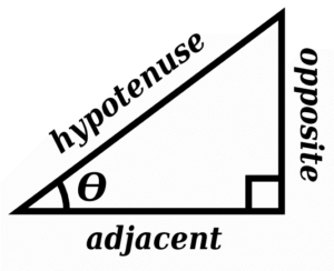
When you make a diagonal side on a rectangular block, the space left behind is a right triangle. The value that you need to find is the length of that triangle’s base — the distance from the rectangle’s original corner vertex to that vertex’s new location. Because of the principal described above, you need to know two of the triangle’s other values in order to find that length. You can control the image’s height, so that value is known. The other value you should know is the angle of the diagonal. In order to follow the instructions in this article, use the angle from vertical.
The relevant trigonometry formula here is opposite = tan(θ) * adjacent, where θ represents the known angle and opposite and adjacent refer to the sides of the triangle relative to that angle. tan(θ) means “the tangent of the angle,” which is a value you can find using a programming function, a scientific calculator, or a reference table.
For example, if your image were 400px wide by 300px high and you wanted a vertical angle of 15°, your required distance would be:
tan(15°) * 300px = 80px // rounded to nearest pixelDropping that into the `clip-path` property from before would give you:
.parallelogram-container {
    --corner-offset: 80px;

    clip-path: polygon(
        var(--corner-offset) 0%,
        100% 0%,
        calc( 100% - var(--corner-offset) ) 100%,
        0% 100%);
}
That’s not quite enough, though. This class will generate a 15° diagonal, but only for containers that are 300px high. To make it flexible, use a custom property for the height, then set the height on each html element.
<div class="flex-wrapper">
  <div class="parallelogram-container" style="--height: 100px">
    <img src="https://picsum.photos/400/100" alt="400 x 100">
  </div>

  <div class="parallelogram-container" style="--height: 350px">
    <img src="https://picsum.photos/450/350" alt="450 x 350">
  </div>

  <div class="parallelogram-container" style="--height: 200px">
    <img src="https://picsum.photos/400/200" alt="400 x 200">
  </div>
</div>
.parallelogram-container {
    --tangent: 0.268;
    --corner-offset: calc( var(--tangent ) * var(--height, 0) );

    clip-path: polygon(
        var(--corner-offset) 0%,
        100% 0%,
        calc( 100% - var(--corner-offset) ) 100%,
        0% 100%);
}

.parallelogram-container img {
  display: block;
  width: auto;
}

.flex-wrapper {
  display: flex;
  align-items: flex-start;
}

.flex-wrapper > * {
  flex-grow: 0;
  flex-shrink: 0;
}

.flex-wrapper > .parallelogram-container:not(:first-child) {
    margin-left: calc( -1 * var( --corner-offset ) );
 }
There you have it: one class and one custom property per image container gives you consistent parallelogram clipping across your entire design.