

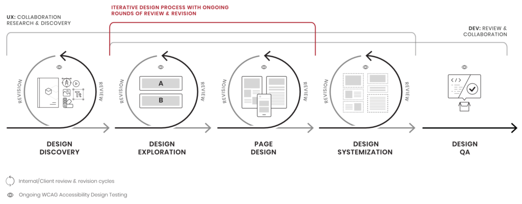
What is accessibility? In web and application design, accessibility means how many people can use your interface. Design trends and standards can make it sleeker, cooler, easier, or harder to use, but every design choice has an impact on the whole system’s usability — and some choices can exclude entire categories of people from accessing a website or product. As designers, it’s our job to know what those choices are and make sure as many people can use our design as possible.
This means designing for various types of disabilities, including vision, hearing, mobility, and cognitive impairments. And it’s not just a numbers game – all of us experience impairments at some point, whether you’re dealing with broken computer speakers, injured your mouse hand, or are looking at your screen outdoors on a sunny day.
Making web designs fully accessible might sound like an overwhelming task, but color contrast compliance is easy, and it’s also something you can start doing right away.
Accessible Use of Color
Color plays an important part in a design. Colors evoke emotions, feelings, and ideas. Colors can also help strengthen a brand’s message and perception. Yet the power of color is lost when a user can’t see them or perceives them differently.
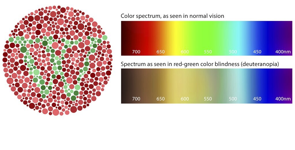
Color blindness affects roughly 1 in 12 men and 1 in 200 women. Deuteranopia (red-green color blindness) is the most common form of color blindness, affecting about 6% of men. Users with red-green color blindness typically perceive reds, greens, and oranges as yellowish.
Poor contrast between foreground and background colors make it harder to see for users with low vision, using a low-end monitor, or who are just in direct sunlight. All text, icons, and any focus indicators used for people navigating an interface with their keyboard should meet a minimum contrast ratio of 4.5:1 to the background color.
Color Accessibility Tips
- Don’t use color as the only visual means of conveying information
- Ensure sufficient contrast ratio between foreground and background
- Incorporate appropriate iconography, underlines, labels, and messaging
- Consider the use of patterns and textures
- Avoid problematic color combinations
- Include accessibility color standards in your style guide for easy reference
What is AA vs AAA? How to read your contrast checks and determine whether or not your design meets the standards
The Web Content Accessibility Guidelines (WCAG) provide technical specifications to improve the accessibility of web content, websites, and web applications across all devices for people with a wide range of disabilities — including auditory, cognitive, neurological, physical, speech, and visual disabilities.
WCAG guidelines are published by the Web Accessibility Initiative of the World Wide Web Consortium (W3C), which is the main international standards organization for the internet.
When checking contrast for colors or text virtually anywhere, you’ll find the labels AA and AAA pop up frequently. These are the different conformant levels for contrast checking based on the WCAG 2.0 standards for accessibility.
Priority Levels
Here are the priority levels for AA and AAA, and how they’re determined.
Level AA requires a contrast ratio of at least 4.5:1 for normal text and 3:1 for large text, and a contrast ratio of at least 3:1 for graphics and user interface components (such as form input borders). Level AAA requires a contrast ratio of at least 7:1 for normal text and 4.5:1 for large text.
- Double A (AA) compliance is the acceptable level of accessibility for many online services, and should work with most assistive technology. This is the level most of our clients strive for on their websites.
- Triple A (AAA) is the gold standard level of accessibility, which provides everything for a complete accessible compliance, crossing the Ts, which make the difference between a pretty good experience with some roadblocks, and an excellent one that everyone can use.
Our Favorite Design Tools for Accessibility
Designers test colors using tools such as the ones featured below, inputting values and making sure the ratios meet the WCAG standards. But inevitably, transparencies, shadows, and a countless number of other design details shift as we work. And as those details change, so do the colors, and what may have met the standard before no longer does. The tools we recommend here can be used while you work to ensure that you’re always using accessible color combinations.
Our design app of choice is Figma, so we started our search for a plugin that could help us test color contrast as we go. We wanted a solution that did two main things:
- Quickly figure out the contrast ratio for any layer we select
- Measure colors on transparencies, blends, gradients, and images.
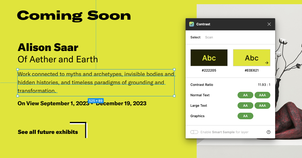
Figma Plugin: Contrast
Contrast is a Figma plugin that makes it easy to check the contrast ratios of colors as you work. Select a layer and Contrast will look for the color directly behind your selection and give you the contrast ratio between them, as well as the passing and failing levels from the WCAG guidelines.
Features of Contrast, from the Plugin Site:
- Select elements to automatically find the color behind them
- Scan entire pages to see all text-layer color issues
- Works on any element, not just text
- Fast and responsive—keep it open as you work
- Supports image and gradient backgrounds with Smart Sampling
- Supports solid, transparent, blended fills, layered fills, and backgrounds
- Live updates as you change the color, opacity, or blend of the selected element
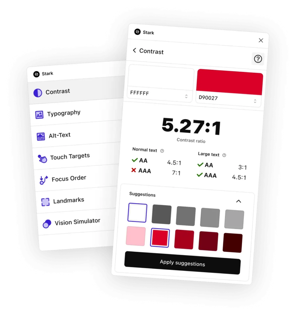
Figma Plugin: Stark
With tools like Contrast Checker, Focus Order, Alt-Text Annotations, Vision Simulator, the Stark plugin helps you find accessibility issues while you work and goes beyond just color contrast.
Features of Stark, from the Plugin Site:
- Check contrast ratios and get color suggestions to ensure your design always adheres to AA or AAA requirements
- Simulate what your design may look like for people with different types of vision, including 4 different forms of color blindness and blurred vision
- Generate any simulation as an artboard that lives alongside your existing design, so you can give your team a better sense of what people with different vision types might see
- Design for easy navigation with Landmarks and Focus Order, allowing anyone to experience your product with screen readers and other assistive technologies
- Get actionable suggestions when writing and testing for alt text optimized for screen reader users and even SEO ranking with search engines
- Analyze the typography in your design to check that fonts and type styles are legible and readable for people with different vision types
- Ensure touch targets in your mobile design and code are large enough for everyone to complete tasks with a tap
Websites We Use for Accessible Design
WebAIM
Colorable
Adobe Color
Contrast Finder
Accessible Web
Coolors
Color Review
Color Oracle
Sim Daltonism
Colorfilter
Working Together Towards the Goal
Every designer should aim to create digital products that can be used by the widest range of people. To do that well, you have to think of people as unique, diverse individuals who have differing abilities at different times in their lives, based on their own particular environment. Color is just one part of accessible design, but tools like these help our teams make better decisions, and do it easily. Designers, developers, and project managers all have a part to play and need to be knowledgeable of the role accessibility plays in making better experiences.