Atomic design and design systems are part of NewCity’s modus operandi. So naturally, we pay close attention to the patterns we create and encounter in the digital space.
One that we see and use a lot — the teaser — has a common design and usability flaw — the “read more” link.
What is a teaser?
You see them all the time. A teaser usually consists of three or four parts: title, image, descriptive text (optional), and a link that leads to the content the pattern is “teasing.”
This pattern can be used throughout a site. Examples include:
- news articles highlighted on the homepage
- section landing pages leading to various child pages
- events on a content page
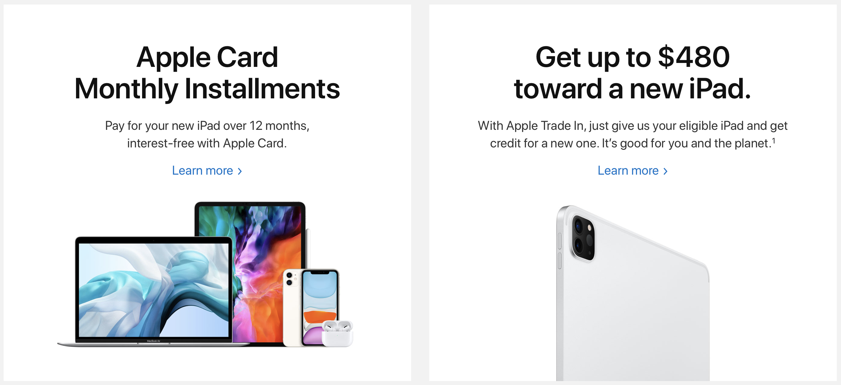
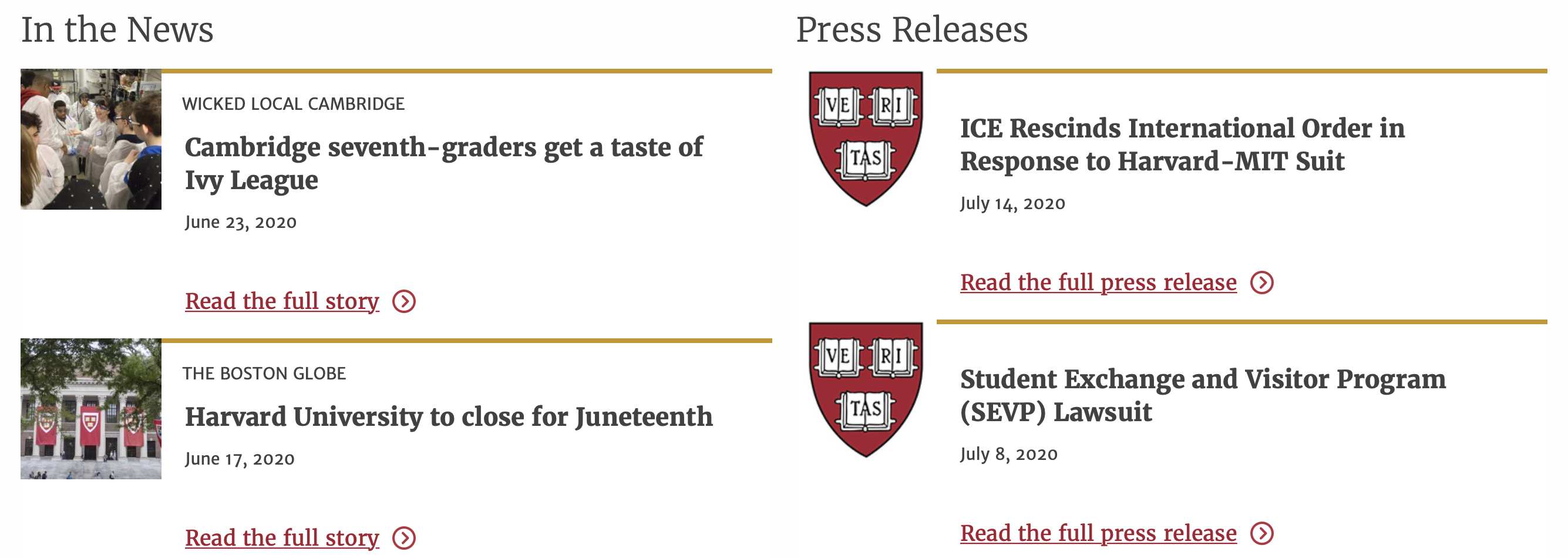 These “Read the…” links can draw your eye away from the more compelling headlines
 How necessary are Amazon’s “more” links?
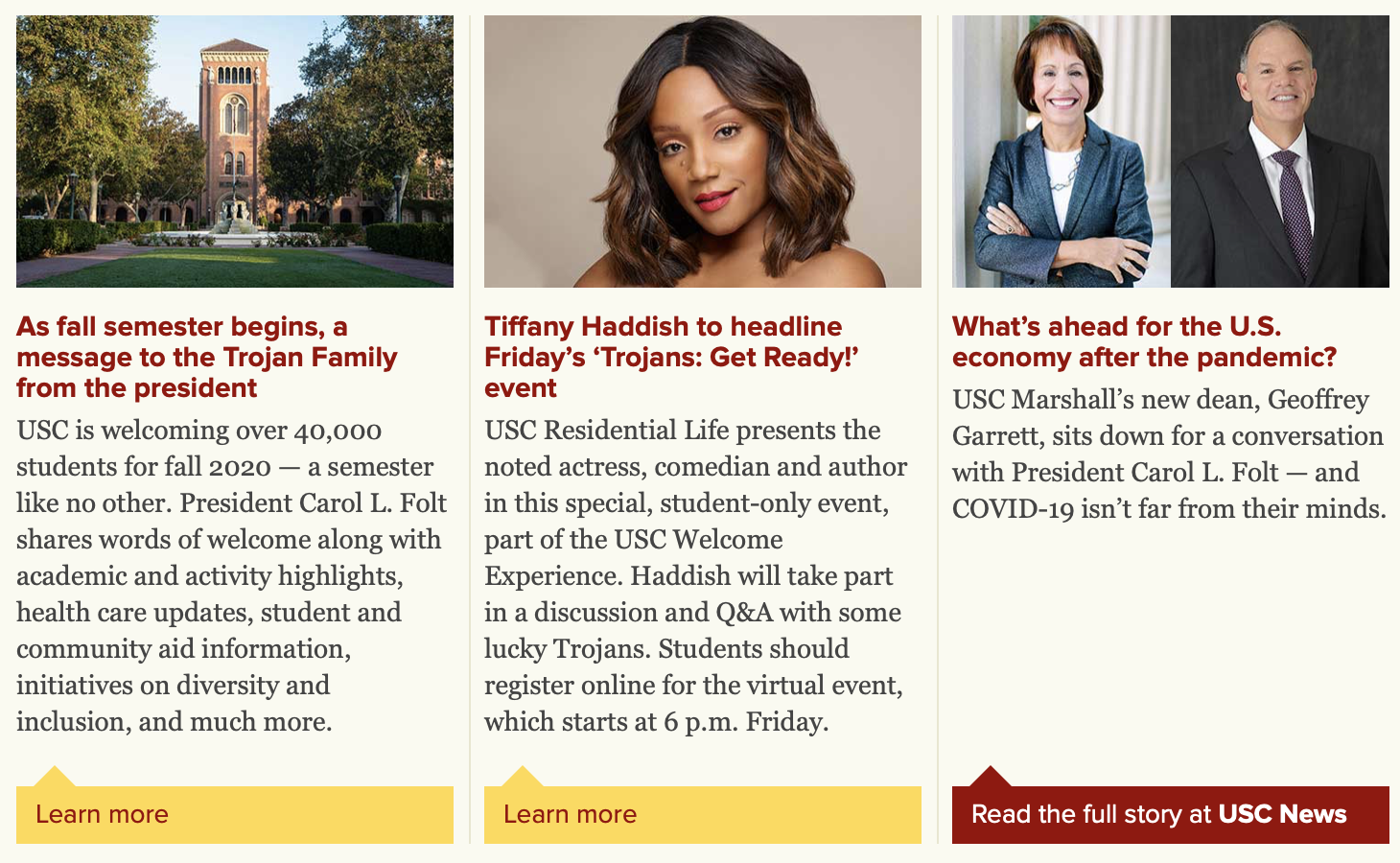 These are nicely written headlines — “Learn More” is redundant
Teasers are ubiquitous because they are useful and can add visual interest to a page. In fact, we often design several variations to give content editors visual and structural options.
When Teasers Go Bad
But there’s a common issue with teasers that we want to encourage everyone to move away from. It’s actually baked into the four part formula: when separate content fields are used in the CMS for a teaser’s title and its link text.
The goal of the teaser pattern is to guide users to a specific piece of content. It is not a call to action (CTA) that leads to a form, login, or signup. (In those cases, we absolutely recommend action-oriented button text like Submit, Log in, Pay, Sign up, Apply, etc.) Therefore, there is no difference between the title of the teaser and the link text!
When titles and link text are separate fields, you’ll often see patterns like this, with multiple “read more” links repeated on the page:
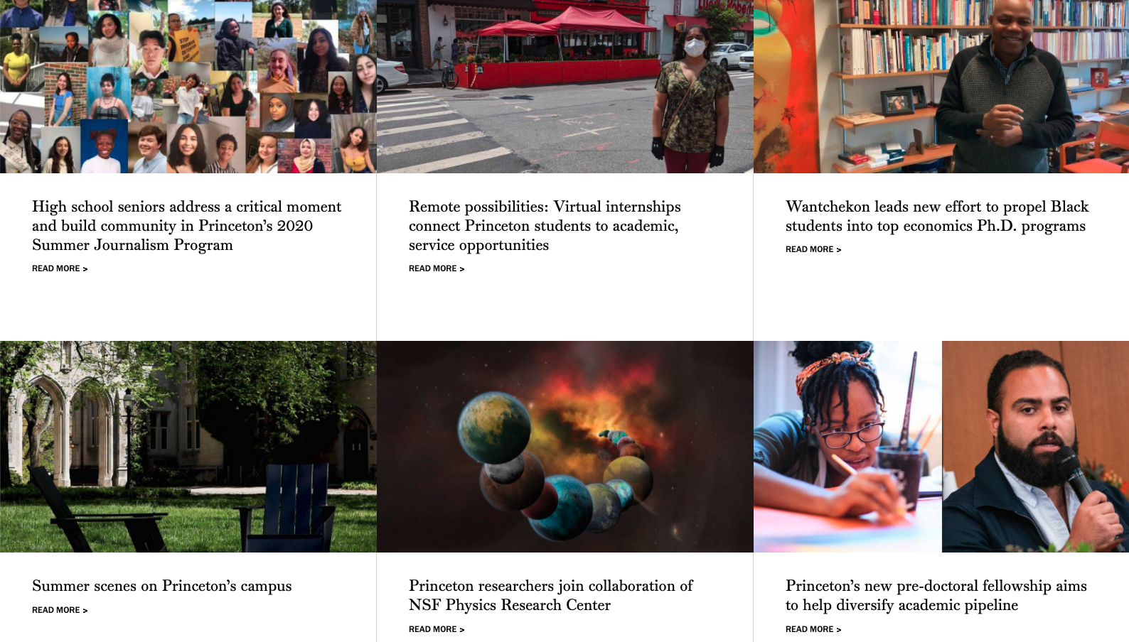 The 6 “Read More” links here don’t guide the user experience
No More “Read More”
You might be surprised to discover that link text like “Read More,” “Learn More,” and “Details” presents a number of problems. A Nielsen Norman article points out the usability and accessibility concerns:
- poor “information scent”
- hard to scan
- poor context for users on screen readers
The article suggests three ways to improve these links. The first two — 1) use keywords that describe the link’s destination, and 2) retain the Learn More format and add descriptive keywords — present their own challenges. Take it from us: it’s really hard to write a unique title and link for the same piece of content! Not only do our clients struggle with it, so do our own highly-qualified content strategists.
What We Recommend: a Win-Win-Win
This leads us to option #3 — convert the preceding-paragraph heading into the lone link.
Rather than struggling to say the same thing two different ways in the space of a few hundred pixels, we make the title the link. It’s easier for content authors to write, easier for sighted users to scan, and easier for users of screen readers to understand and interact with. It’s a win-win-win! Try counting the number of teasers on your website and you’ll see why this small change has big benefits for both admins and users alike.
Here are a few examples from our recent projects.
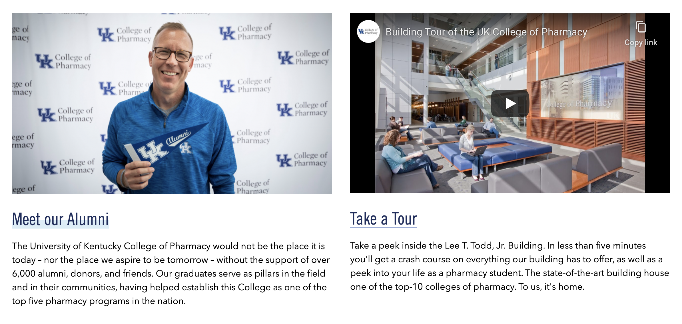
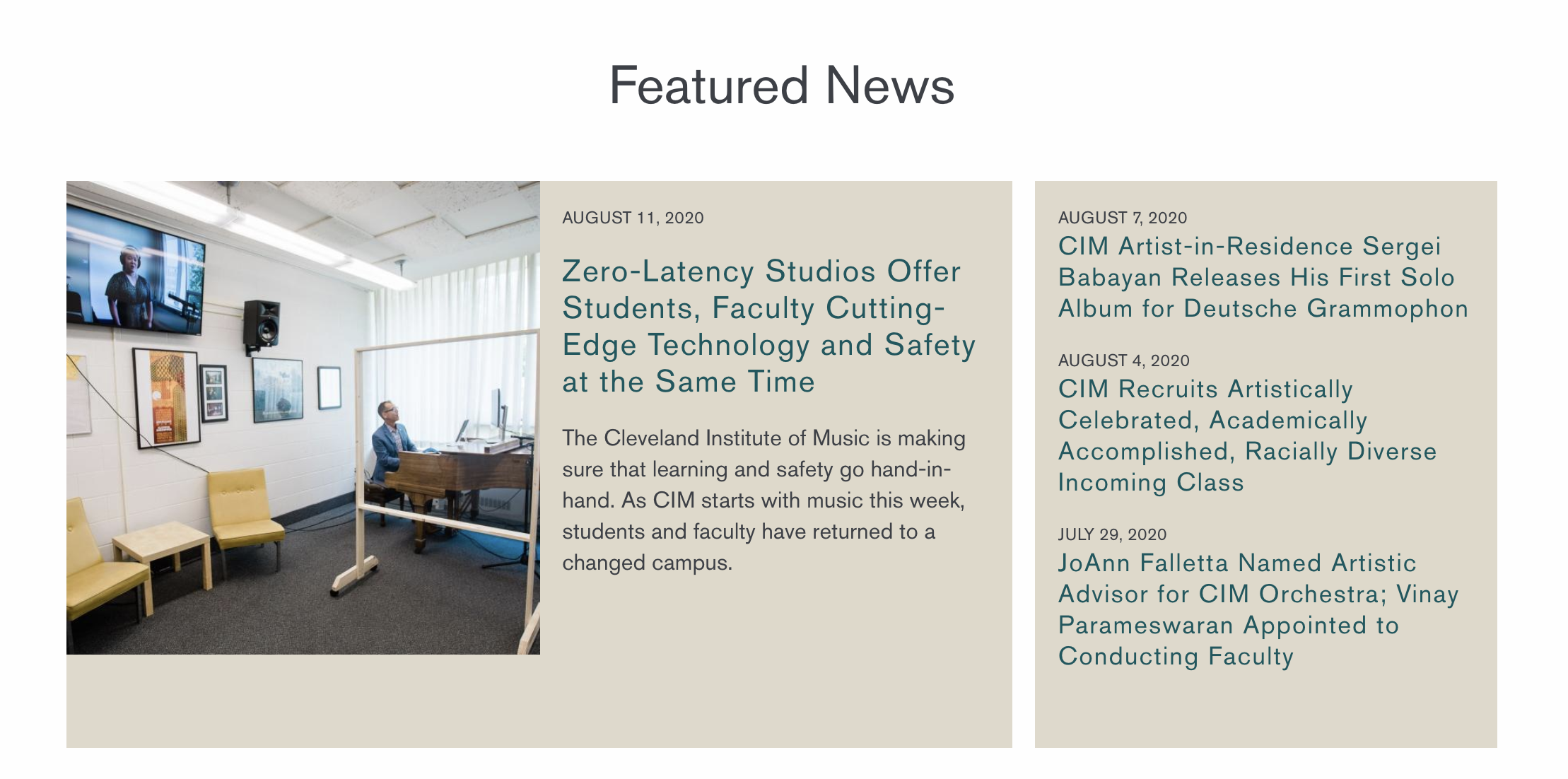
You can get more from your text links, without Read More, Learn More, etc.
