
Summarizing and reporting data about your website can be difficult to do in an engaging way. Data tables and complex visualizations from Google Analytics show larger trends, but don’t always communicate what users are doing on the page-level:
- Which link are users clicking on?
- Are they scrolling to the button?
- Did they even look at the checklist in the middle of the page?
- And how do those behaviors change on mobile?
Heatmaps can help you answer these questions. Many tools are low cost and easy to use, and can be especially effective in engaging stakeholders. They can also help prevent endless rounds of internal debate over what you think users might do, or what should go where on the page.
Heatmapping can also give you real time, detailed feedback on how users are interacting with key pages, so you can make revisions that immediately improve the user’s experience and help your organization achieve their goals for key pages.
What is a heatmap?
A heatmap is a data visualization that uses color to represent data values on a spectrum. They allow you to glance at a large dataset and immediately see highs and lows.
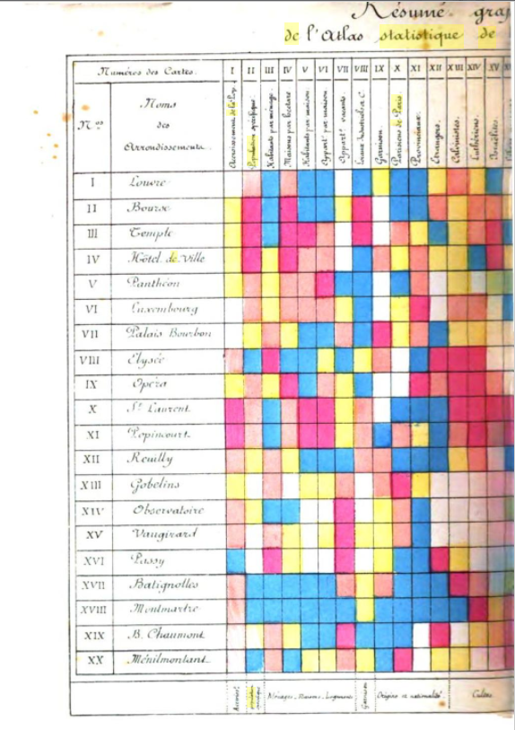
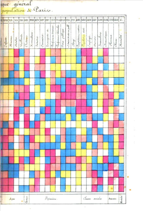
Heatmaps have been around since at least the 19th century and have been used to present many types of data, including business, financial, geographic, and even sports. Below is an image from an 1873 Paris population report that summarizes demographic information from 40 separate maps. (Source: The History of the Cluster Heat Map)
When it comes to websites, there are several types of heat map visualizations commonly used, including clickmaps, scrollmaps, and mouse movement maps (each of which we’ll explain below).
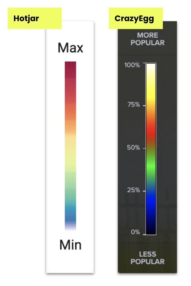
Today there are a variety of heat mapping tools to choose from. The two we use most often at NewCity are Hotjar and CrazyEgg. Keep in mind that most of these tools do more than heat mapping, so you may find other great uses to supplement your analytics toolkit.
Why use a heat mapping tool?
There are several reasons to add heatmaps to your analytics toolbelt.
Better understand page level interactions: You may want a more detailed understanding of what’s happening on a page. Are users clicking, scrolling, and moving in ways we expect? \
Get a holistic picture of navigation paths to external tools: You may want to get a better idea of how users are navigating across all your different domains that may not be tracked in the same analytics property. Particularly on pages with a high exit rate — are users going to your tool or form hosted on another domain, or are they just leaving?
Engage stakeholders: Visualizations can be a great way to engage stakeholders, and allow you to show patterns in the data more easily. Heatmaps can introduce them to the data, before you get into nerdy data tables.
How to read a heat map
Fortunately, reading a heatmap is very simple. The colors correlate with frequency of the action.
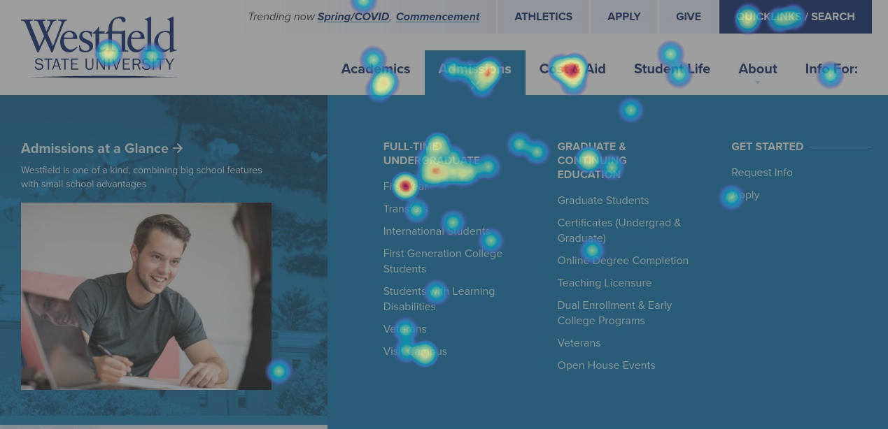
So in this clickmap, the links that are red are getting the highest frequency of clicks on this page; the greenish ones less so.
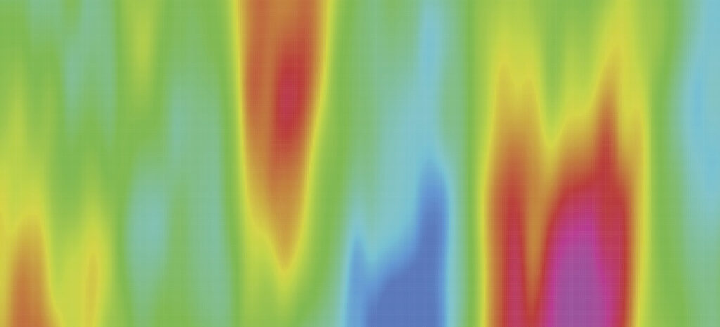
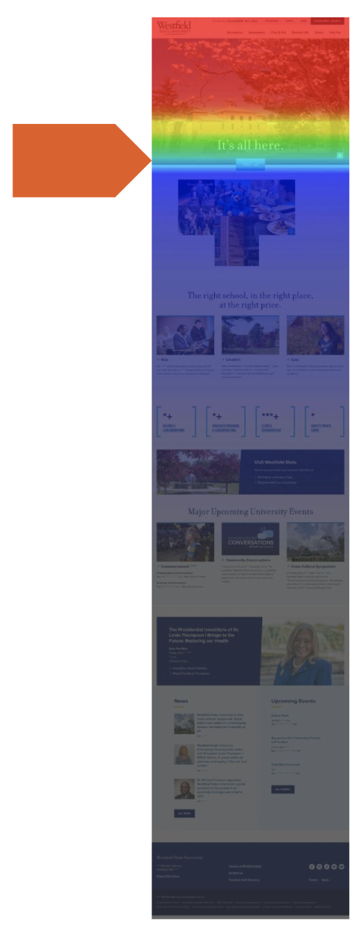
And in this scrollmap, 100% of desktop users are seeing the top of the page in red and 50% are getting down to the area where it starts to turn greeny-blue.

But do keep in mind that different tools use different color scales.
In most cases you can hover on an element in the tool (or switch to an alternate view) to get a precise percentage of a particular location. And that’s important, because sometimes the colors can be misleading, so always check the numbers!
For example, the size of a clickable area can skew the visualization. Below, “Apply” may look like it’s getting more clicks than “Connect/Visit,” but in reality, they’re not much different. It’s just that the clickable area of “Apply” is smaller so the clicks are more concentrated spatially.

As mentioned previously, there are different types of heat maps that can be used to answer different questions. Following are the three types of heatmaps we most commonly use at NewCity.
Clickmaps
Clickmaps tell us what users are clicking on and are useful when you want to see how users are navigating from a page.
But which pages should you start with? If you don’t have a specific question in mind, try starting with your most viewed pages and/or your top entrance pages.
Are users clicking on the elements that we want them to? Navigation menus, primary actions?
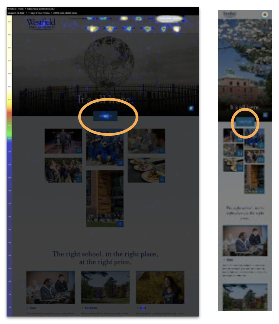
In the example below, mobile users aren’t clicking on the “Visit” button — is that a problem? We’ll have to dig a bit further to answer that question, but it gives us a great place to start.
You may also have a home or main landing pages that have high exit rates. You may assume or hope that users are exiting to the external tool or form we want them to go to, but we can’t always tell in Google Analytics. Your clickmap will let you see all that in context.
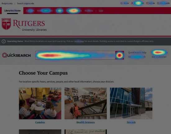
In the example below, we can see a large percentage of users clicking to our library’s external discovery tool, thus explaining the higher exit rate on this page, and clarifying that it’s expected behavior.
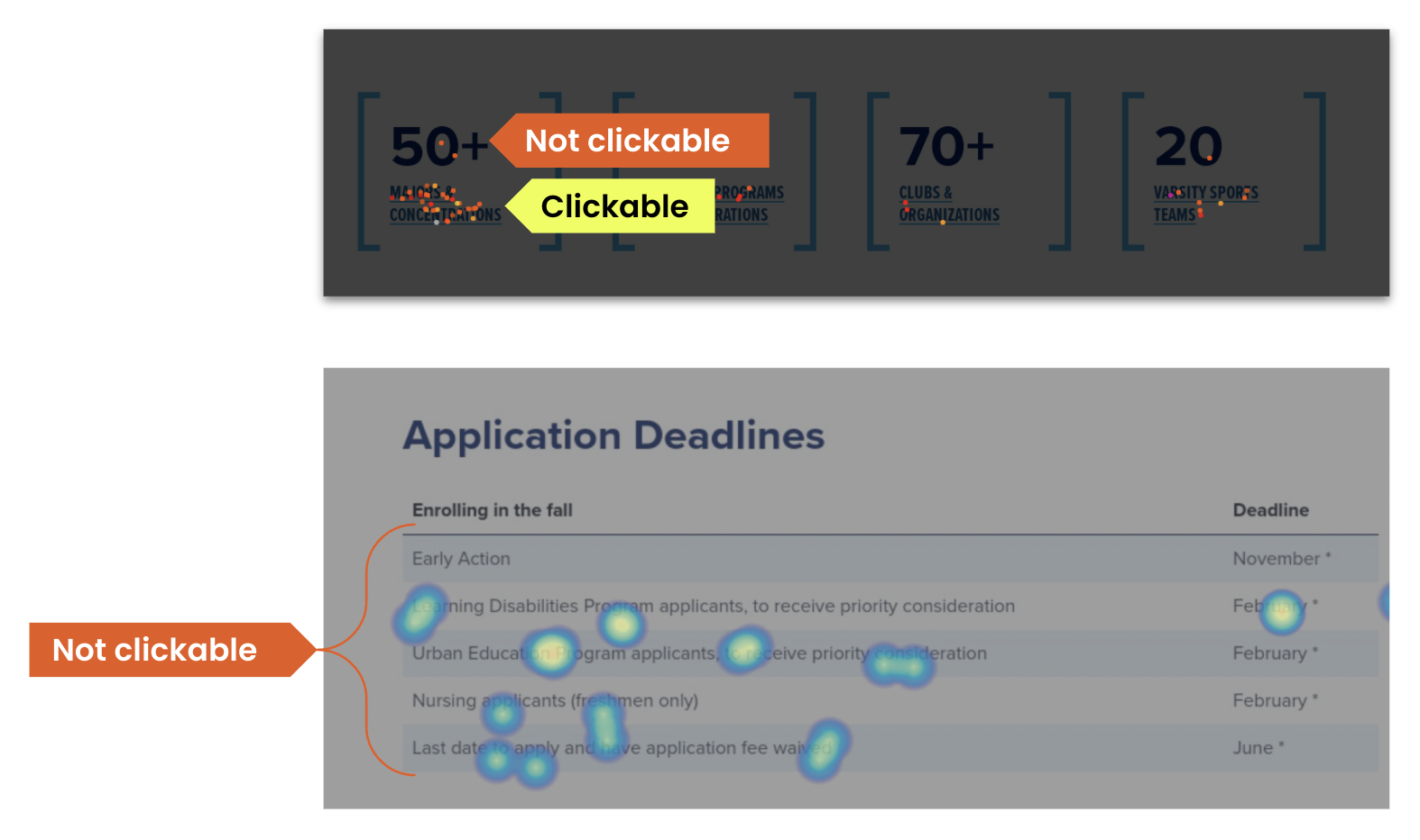
Clickmaps also show us where people are clicking that isn’t clickable. In general we want to fix those unclickable items. In some cases, that might mean first talking to a few users to understand what they expect to happen when they click on that item.
And check your “rage clicks” (area where a user clicks repeatedly) — these can indicate either something that isn’t clickable (but should be) or broken items.
Scrollmaps
Next, take those same pages you looked at for your clickmap and switch to your scrollmap view. This shows where users stopped scrolling. Pay attention to abrupt shifts in the colors; these can indicate that users on the whole may feel the page is no longer useful.
Are we inadvertently signaling the end of the page? Elements with dark backgrounds, for example, can feel like a footer even when they aren’t. Or we may have inserted some content that feels more tangential to the purpose of the page.
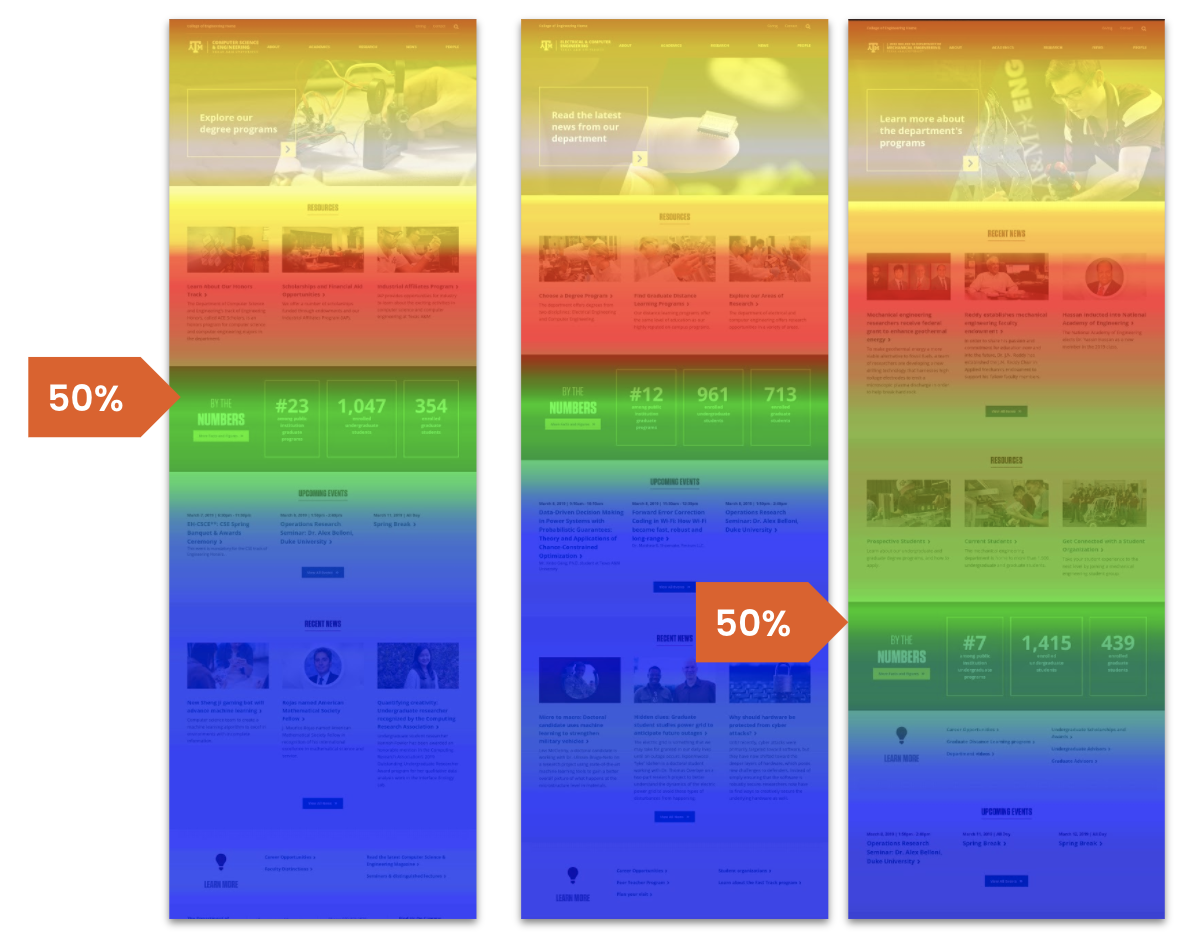
Another useful exercise within scrollmaps can be to compare layouts across similar pages with similar amounts of traffic. Is there anything you can learn about design or content choices that are impacting user behavior?
In this example of three department pages on the same site, we saw that users stopped scrolling around the “By the Numbers” block, despite it being much lower on the example at far right. We hypothesized that the darker background of this block might feel like a footer and was preventing users from moving further on the page. Maybe that’s OK, maybe the items further down the page aren’t all that important (or are important to a much smaller subset of users). The content authors can experiment with different placement and see how it impacts behaviors to create the desired outcome.
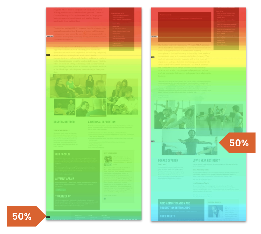
That said, I urge caution with drawing any sweeping conclusions. Not everything will always be true in every case. In the example below, the scrollmap showed us that in the program page on the left users engaged well past the image collage, with a majority continuing down to the footer. But on another graduate program page (also in a similar area), users seemed to be blocked by the image collage. Why? We don’t know without user testing. But it gives us something clear to test.
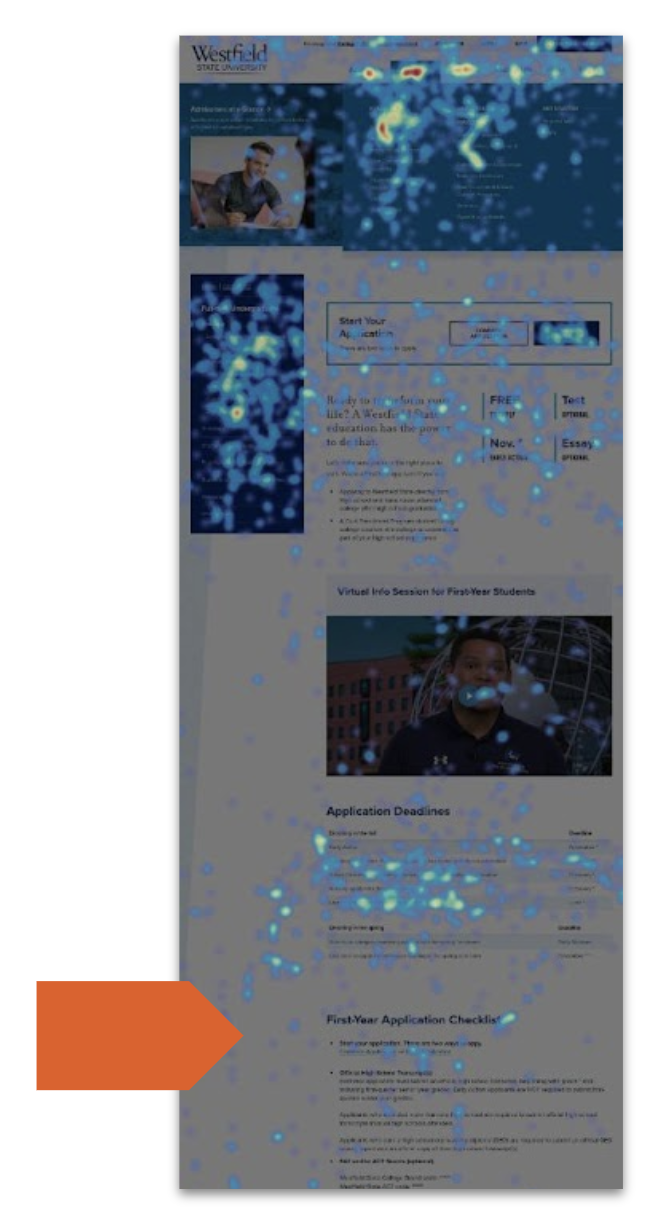
Mouse movement
Mouse movement maps show us how users moved their mouse around the screen on a desktop. And since there is a strong correlation between mouse and eye movement, these maps can help us look at where people may be focusing their attention.
Where did they engage with the page and where did they stop? Paired with our scrollmap data, did users scroll past this part? Or did they not even make it here? Did they look at the header for this section and decide it wasn’t relevant? It could make sense to break the content out into other pages.
What heat mapping does NOT tell us
As you can see, heat mapping can be a very powerful tool. But it doesn’t tell us everything we need to know. Most importantly, heatmaps can tell us how users scroll and click, and where they focus their attention, but they don’t explain why they do what they do. Qualitative data from usability testing is needed for that.
However, heatmaps can help us really focus our user testing so we are examining actual problems. And in some cases we can make a change right away without testing. For example, users not scrolling past a certain element when they should can lead us to tweak our designs — reorder the elements on a page, shorten copy, break it into different pages, and track changes over time.
Give it a try
We find that heatmaps are a great addition to your analytics toolkit. They can empower you and your team to easily demonstrate how a page is working (or not) and make changes that improve the user experience. See how far users scroll on your homepage or how they move through your key landing pages before they click. And let us know what you find! We’d love to hear about your findings and share ideas.