
The purpose of a design review is to take a starting point and get it closer to an ideal finished product through actionable feedback. Period. That’s really as complicated as it gets.
However, when presenting creative work, there are a few things that always impede the inertia of awesome. Things like opinions, politics, stresses, “experts,” miscommunicated constraints, and “WIBCIs” (Wouldn’t It Be Cool Ifs). These will derail a train headed toward great and send it careening into entropy before it even leaves the station.
I may sound cynical, but I’ve been doing this for almost 18 years. I’ve heard everything under the sun as far as feedback goes, and most of it is far from actionable. I’ve come to realize that it really falls upon us to educate clients in how to “speak design.”
So the other day, when my new favorite client asked me — “Brian, what kind of feedback is useful to you after we review designs?” — I nearly kissed him full on the mouth. Regaining my composure, I shared with him what you find below.
It must convert.
Simply put, the designs you’re reviewing are a business tool. They are not art. The question you should be asking is not “Do I like it?” Ask “Does this help us meet or exceed our business goals?”
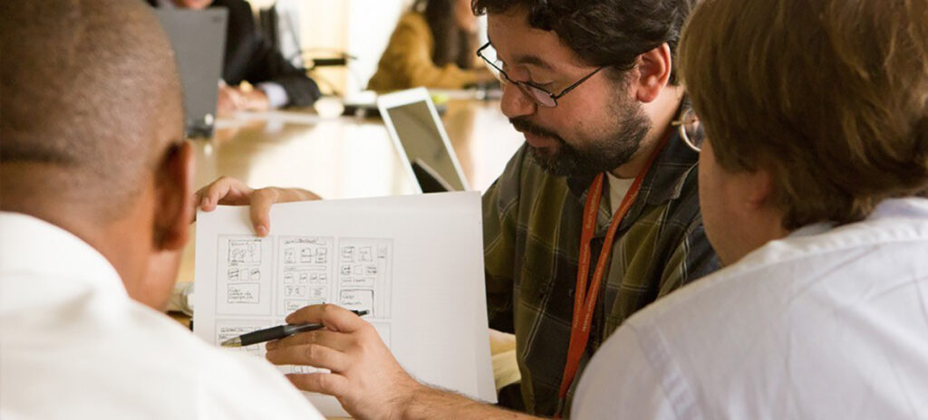
I recently left a meeting with a local CrossFit franchise where I presented some homepage designs. Prior to that point, we had done user research with potential clients, veteran CrossFitters, and beginners to the sport. We had a very clear idea of what each type of user needed to see to get them to the next step. (AKA conversion.) Design must not get in the way of that. Ever. The sole point of their site’s existence is not to show pictures of sweaty people, but to get more people to spend money sweating. The feedback I got was as follows:
- “I like it.”
- “Not crazy about purple.”
- “It doesn’t feel like us.”
- “I don’t want my headshot to be so static.”
Being an expert by now at deciphering feedback, I quickly got to the feeling that the site structure worked for them, but they had it in their heads that it should look “hardcore CrossFit” and show shirtless dudes with 5% body fat doing crappy pull-ups. (Sorry, I have a beef with CrossFit pull-ups.) But in the end, appealing to Joe and Jane Average was where we identified the most opportunity for conversions. Thus the design, imagery, colors, and language were crafted to engage that audience.
Be focused on design.
Feedback on content is not design feedback. I have been called on to “right the ship,” so to speak, when a client told a project manager they have an issue with a design, only to find out they had issues with content hierarchy, not design or concept. There is always a time to finesse content. But to make the best use of time when selecting a design direction, view the design as a means to communicate your content. What level of effort will it take to maintain? Does it make your job easier? If not, is the payoff exponentially worth it?
I often get asked “How much do you weigh a client or institution’s own personal culture or ‘brand’ into a design?” A ton, and it’s one of the accolades we receive most often — that we “get” our clients. But the need to build an effective business tool outweighs the need to be something image-driven like Nike.
I mention Nike because image IS what makes someone on their site convert, eventually. Usability and conversion come in second for them. Think about it: you’re not buying shoes from Nike.com. You’re sold on image and brand, then go buy them locally or on Zappos. But in the case of education audiences, design and usability have to go hand in hand and compliment one another.
Why dislike the design, do you?
Wise old Yoda. Whether you like or dislike a design shouldn’t be seen as the end goal. Seeing a design, not liking it, and being able to tell me exactly why it doesn’t meet your intended business goals will allow me to make revisions or start from scratch in an entirely more informed place.
Conversely, also tell me if you get goosebumps when I flip the boards because everything falls into that perfect harmony where design and content hold hands and walk down the beach at sunset. It is not about art, you will not hurt my feelings or inflate my ego. You will only harm your business and the success of the project by not speaking up or skirting around WHY you feel something works or doesn’t work. Be honest.
“I’m not a designer.”
Lots of people don’t feel qualified to evaluate designs because they aren’t designers themselves. But neither are most users of your site, so your ideas are still important. You make design decisions on a dally basis, like getting dressed in the morning — think of website design like you would choosing what to wear for a job interview. Yes, you want to look good, but more importantly, you want to communicate messages that will leave a good impression on a potential employer.
Don’t judge the visual design based on personal preferences, but try to think about what messages it’s conveying and whether they’re right for your business. Whether a site is green or blue matters very little when it comes to getting the information you need or communicating messages that convert.
It’s not a vote, it’s a conversation.
Remember that the designs you are being presented are the starting point to an open conversation. Visual directions that you may or may not have thought of. Ultimately they’re the culmination of research and collective institutional goals, so talk about how well you think they interpret those.
Also remember to be direct. Having a reaction to a design is great, but providing feedback that can directly relate to user need is actionable. Trust me. You won’t hurt my feelings; I’ve been doing this a long time.