

In October 2015 I gave a talk at HighEdWeb titled Selling UX. We went through 8 use cases where you might face resistance to good user experience practices on your website. The “everyone else is doing it” scenario stirred up several questions, so I wrote this post in response. In this scenario, someone points out a feature or approach on another college or university’s website as a “best practice,” and asks for the same thing on yours.
But just because everyone else is doing it doesn’t mean it works, or that it will work in your case. We advise clients to always look at the data, and find a way to experiment with an idea before you invest in it.
These are the top 5 “best practice” examples we’ve noticed that higher ed loves to follow.
1. Carousels or Sliders
There are many flavors of carousels, but I’m referring to the big featured image or slide that rotates through a set. It’s a favorite “best practice” on home pages.
There are some circumstances where a manually-triggered carousel can work, but the data doesn’t look good for auto-advancing carousels. These helpful posts explain why:
- http://www.nngroup.com/articles/designing-effective-carousels/
- http://www.nngroup.com/articles/auto-forwarding/
- http://conversionxl.com/dont-use-automatic-image-sliders-or-carousels-ignore-the-fad/
- http://erikrunyon.com/2013/01/carousel-stats/
You can use a carousel to placate people who want their stuff on the home page when you don’t have room for it. But that would be disingenuous, wouldn’t it?
2. Audience-based Primary Navigation
One of the hardest information architecture challenges is figuring out how to organize a website that needs to serve multiple audiences with widely varying but overlapping goals. Higher ed sites are a great example of this. A parent of a high school student may want to read about successful alumni, or a current student may want to read about research opportunities.
There are two main ways to approach this.
- Audience-based navigation. Organize your nav around user types, like:
- Prospective (or Future) Students
- Current Students
- Faculty & Staff
- Researchers
- Alumni
- Friends & Community
- Task-based navigation. Organize your nav around top task groups, like:
- About Us
- Academics
- Admissions
- Student Life
- Research
- Athletics
- Offices & Services
Some organizations will do both, giving one or the other more prominence. But which works better?
Comparing analytics across a wide range of higher education websites, our data show that, for those colleges or universities that provide both audience and task-based navigation, task-based nav gets between 1.3 and 25 times more clicks than audience-based navigation. On average, task-based navigation outperforms audience-based by a factor of 9. This will be affected by screen layout and the specific navigation terms used, and you should test it with your own site. But the trend is clear, and we haven’t seen a case where audience beats task nav.
This makes sense if you consider how people navigate naturally. According to research on information scent, if a user comes to your website with a specific goal in mind, they’ll scan the site and click on the first link that looks like a good candidate to help them reach their goal. They’re not typically asking themselves “What kind of person am I?” when they’re looking for things to click on.
So a student wondering what the campus looks like may click on “About Us” or “Student Life” before choosing “Future Students.”
Nielsen Norman Group just published a report on audience-based navigation, giving 5 reasons to avoid it (as well as some examples where it’s done well).
3. Tabs on Degree Program Pages
This one’s pretty simple, really. Research shows users would rather scroll, scan, and read on any sort of product page, rather than click to sub-pages (look at Amazon’s product pages, for example — it’s clear they know this). A degree program page is a product page, but we still sometimes see sites using tabs to make all the links to supporting content visible “above the fold.” (The fold is a myth too.) Or these important links might be in a left or right nav bar.
If these links go to pages that are incredibly long, consider summarizing or excerpting them on the main degree program page.
This is a heat map showing where users clicked on a tab bar on a website that NewCity designed a few years ago for Old Dominion University Online. Notice how many people went straight to Curriculum? And how many didn’t choose Admission Requirements?
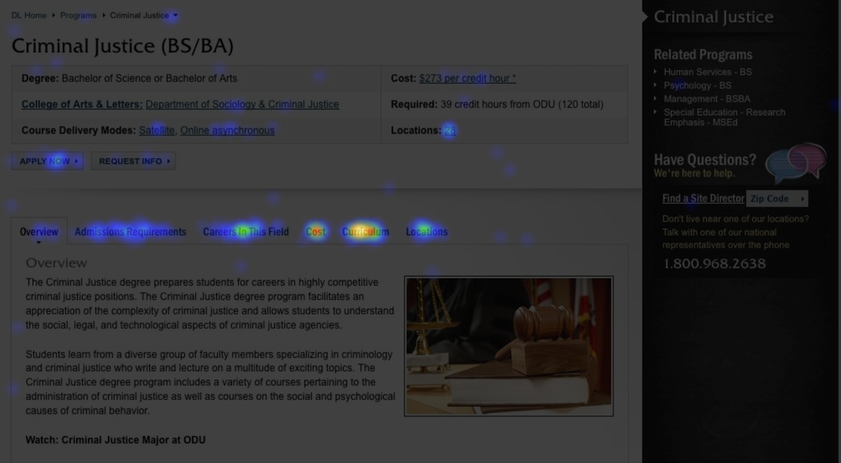
We later revamped it to put all the essential content on one page, along with more information about how ODU’s program compares to others. The result was a dramatic increase in inquiries.
Longer pages do have to incorporate design elements that encourage scrolling, so that it doesn’t look like the end of the page when there’s still more content to discover.
4. Subdomains
Subdomains are a challenge for SEO, but higher ed loves to use them whenever there is a distinct website for a school, college, department, center, or what-have-you under the main .edu domain. For example, the College of Engineering may have a URL like engineering.university.edu. A subdomain is different from a subdirectory, such as www.university.edu/engineering. We’ve seen colleges and universities with hundreds of subdomains.
The subdomain is easier to manage from a technical standpoint. But to search engines like Google, it appears to be a separate website, which can impact your search rankings.
Subdomains also make it complicated to merge your analytics so that you have a coherent view of traffic across your entire site. Not impossible, but difficult.
You may hear site owners argue that subdomain URLs are easier to remember. Take a look at your stats and see how much direct traffic you have (people entering the URL directly in a browser and not using a search engine). You’ll probably see that most people are just searching using the college, department, or center’s name.
There’s nothing wrong with using a subdomain or special URL for marketing campaigns, if it redirects to the subdirectory.
As with everything SEO-related, this advice is subject to change at Google’s whim, of course.
And yes, we’re well aware of the irony that the above ODU Online example uses a subdomain. You can’t always get what you want!
5. Admissions Microsites
Admissions microsites are standalone websites, usually linked to the main website (although not always). They may have a unique design, and they usually try to cover all the main questions a prospective student or parent would ask (majors, costs, student life, etc.).
Why create a standalone site? These are possible reasons…
- The rest of the site is out of the admissions office’s control.
- The rest of the site is chaotic or has inconsistent quality.
- Admissions has a separate marketing budget and doesn’t want to spend it on department websites.
- You want to support admissions campaigns with trackable landing pages and clear conversion paths.
The first two reasons are a coping mechanism, which, though sometimes necessary, is still unfortunate and ultimately counterproductive.
The fourth reason is the best, but there are still important reasons to reconsider a standalone admissions site.
Why is a standalone admissions site not a good idea?
Conflicting Information & Experience
- When someone searches for degree program info, tuition, or other details related to your institution, search engines will send them to your academic departments or your financial aid office before your admissions microsite. For example, a college we worked with recently found that the “Tuition & Costs” page on their business office site (aimed at current students) was drawing twice the external visits as the “Financial Aid & Affordability” page on their admissions site. This internally-focused page had an 80% bounce rate, compared to 56% on the admissions version. Why? The business office site only told students the total cost ($62,000) — nothing about financial aid or the fact that the average scholarship is $43,000.
- Prospective students are smart. (If they weren’t, would you want them to apply?) They know to look in other places to find out what it’s really like there. So they’ll hunt around in Student Life, even though it was designed for current students. Or they’ll check you out on collegeconfidential.com. If the dazzle on your admissions site doesn’t match what they see elsewhere, it introduces doubt.
Missed Information
- When prospective students start from your home page looking to see whether you have the major they want, and they have a choice between something like “Academics” or “Majors” and your admissions site, they’ll pick one of the first two. If the content on your admissions site isn’t integrated into these other sections, they’ll miss it altogether. You end up creating amazing content for your admissions microsite that no one can find when they’re browsing the rest of the site.
Findability
- Most prospective students make multiple visits to your site before deciding whether to put you on their short list. Even if their first visit is in response to a campaign, the second may be a Google search. And in most cases, Google will rank other parts of your site higher in the search results for those terms than it will the admissions microsite. What if they end up with a very different experience the second or third time they visit you?
This isn’t an all-or-nothing proposition. While it’s more of a challenge, you can integrate your admissions site content into the rest of the site, even going so far as to have your departments link to your admissions site for all the degree program info. Just take the standalone part out of your admissions site.
Interested in learning more?
Download the slides from Selling UX at HighEdWeb 2015 [PDF]
Invite us to lead a UX workshop at your organization or conference!