

Oftentimes I’ll turn to illustration when there’s a concern about the quality or quantity of photography on a redesign. Not every client has a vast library of photography to work with. While it doesn’t necessarily work for everyone, illustration is something I love incorporating into a site to make it feel more “human.” There’s a lot of boxiness nowadays with responsive, with the right amount of illustration you can make a website more warm and welcoming.
Among these illustrations, infographics are an approachable and popular technique. If you don’t know what I’m talking about, infographics are visual representations of information, data or knowledge that presents complicated information quickly and clearly. You see them everywhere from higher education sites to Pinterest.
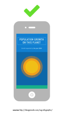 This was taken from a tutorial on creating infographics for responsive design http://designmodo.com/svg-infographic/. It’s how I would approach most infographics nowadays.
The problem with infographics, however, is that they can be tricky to incorporate into responsive design. You’ll often see these illustrations on the web as JPGs or PNGs, which can be risky on mobile.
The good news is that the way we approach infographics is constantly changing. I’ll go over a few top-level solutions that can help you with displaying infographics on the web.
Why should I use infographics?
On the social media site Reddit there’s a term called “TL;DR,” which stands for “Too long; didn’t read.” When a user posts a very long comment, oftentimes they’ll summarize their points in a “TL;DR” at the bottom.
An infographic can basically be like this. It’s a great marketing tool that lets you highlight information in a easy to digest format that otherwise could be skimmed over.
What are the restrictions?
Before you create your infographic, stop and do research to make sure you have all of the data you need. My suggestion is to do a quick sketch first to be sure of your overall idea of your infographic. Try to use as much real data as possible.
 Illustrative Text for Hollins
Once you have the data and you’d like to show it visually, it can be overwhelming to sift through your options. As I mentioned earlier, infographics can be tricky to make responsive. While your statistic looks great on a desktop browser, a static pie chart with small text may not provide a good experience for someone reading it on their iPhone.
To help solve this problem, SVG format is one of the many ways I’ve approached infographics in the past.
About Scaleable Vector Graphics (SVGS)

If you want to create a neat little interactive graph that shows the breakdown of your study abroad trips last year, familiarize yourself with Scaleable Vector Graphics, or SVGs. They are the future of illustration on the Web and I’ve learned to love them.
When you create a JPG in Photoshop, for example, the program takes a picture of your graphic and exports it as a fixed set of pixels. This can cause logos, illustrations, patterns, etc. to appear pixelated on various devices as it scales.
SVGs work very differently. The final product is actually using XML format, which is a collection of code. Because of this, search engines will look at this code (specifically keywords) and benefit SEO. You’re not just limiting yourself to the title of your graphic and alt text, which is an amazing capability for a graphic to have. In addition, SVGs load MUCH faster than a JPG, which can help your rankings as well.
People are constantly accessing your website from different devices. Because an SVG is a vector graphic base, it will scale any size to fit the device. This can be perfect for showing lots of illustrations on a page, as we did with Auburn’s College of Education site. The entire homepage is created using SVGs.
I would recommend having Adobe Illustrator if you’re going to create art, but it’s easy for anyone to make adjustments to an SVG. When you create an SVG, it’s easily editable. If you’re trying to create a donut chart and have plugged in the wrong coordinates, you can tweak it easily in any text editor. Developers can also easily manipulate CSS animations with SVGs.
To summarize the browser capabilities, SVGs are supported by:
- IE 9+
- Firefox 4+
- Chrome 4+
- Safari 4+
- Opera 9.5+
Showing Data
Using SVGs for simple illustrations
Just Text:
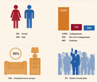
Never underestimate showing text-only infographics. Keep these simple and easy to read. If they’re presented well, they can be just as powerful as a visually heavier infographic. We did a few of these for Hollins after looking to incorporate three calls-to-action at the top of the page:

Static Image + Text:
With Westfield State University, we wanted to create simple responsive graphics that could be regularly updated by their designer. By creating four different illustrations with independent text below, they can be updated more frequently. Since they’re all the same size, they stack easily on mobile devices.
For this particular client, it was actually easier for them to swap out JPGs instead of SVG files with the data.
SVG-Heavy Graphics:
If you have a trigger-happy designer or developer who’s comfortable working with SVGs, you could try illustrating much more than just smaller blocks of content. This is a route you can go if you aren’t updating much and don’t plan on changing the graphics often.
We did this for the Auburn redesign when they were concerned they wouldn’t have the time to constantly update the homepage with photography. SVGs also allowed us to incorporate some CSS animations at the top.
Responsive approaches to Charts:
Sometimes I’ll take on a project with a lot more data than a few numbers or visuals. A chart library may try to enforce a static size, but can be overridden. Here are three chart solutions that have responsive approaches available:
Google graphs:
https://developers.google.com/chart/
Google Graphs is is a new love of mine for displaying infographics on the Web. Whether you need a line chart or map, this JavaScript chart gallery has a bunch of ready-to-use charts to fit your needs.
I’ve used Google graphs for an online Annual Report, and the client was able to take the styles I created and apply them to other charts from the Google Graphs library.
Chartjs.org
This was a great tool used by one of our developers when creating a web app. It’s become a favorite for its HTML5-based, responsive, and easily customized infographics. Plus they scale in size for different devices.
Web: 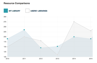
Mobile: 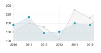
Chartist
https://gionkunz.github.io/chartist-js/
Chartist is another good one that has a few more options than Chartjs. Instead of scaling, it changes the way data is displayed on any device. For example, a desktop chart showing 12 months on its X-axis will change to show only six months on an iPad.
So why does this all matter?
Whether you have some great data to show off or just don’t have any photography to work with, illustration really can make a difference on a plain text page. Well designed infographics will help you break up content, summarize points, and even boost SEO. It doesn’t have to be stressful with responsive design – by sticking with SVG format or utilizing the tools mentioned, you’ll be displaying data on various devices easily.