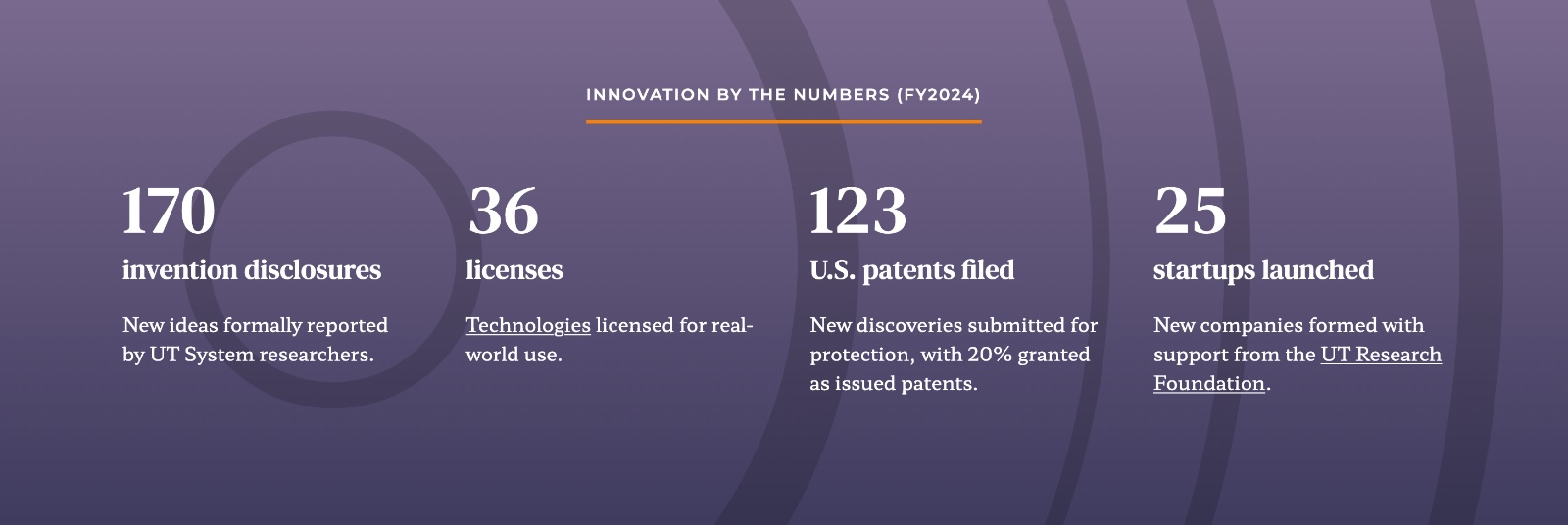
Nuts &
Bolts
Timeline
December 2023 – May 2025
Project Scope
- Discovery
- UX Research
- Content Strategy
- IA
- Wireframes
- Design System
- Intranet planning
CMS
WordPress
Component Library
Custom WordPress
A platform built for today’s users and tomorrow’s goals.
NewCity’s partnership with the University of Tennessee System began at the campus level, first through design work with UT Knoxville and later helping their central web team finish the flagship site. That collaboration grew into the UT Knoxville Web Design System project in 2024, the College of Social Work, and then a redesign for UT Southern, the System’s newest undergraduate campus.
So when the UT System needed to rethink its central website, they came back to us.
System sites are different from university websites. They don’t just represent a single campus, they represent a network of institutions under one brand. In Tennessee, that means five universities plus statewide institutes for research, extension, and public service. Each campus has its own identity, but the System website has to:
- Represent the collective impact of the entire system.
- Clarify the relationship between the System and its campuses.
- Adapt to a system that is growing and evolving.
- Serve a broad mix of audiences—from current and future employees across all UT institutions to policymakers, local officials, industry partners, students, and families.
These needs are not unique to Tennessee. Systems in North Carolina, California, Texas, and beyond face the same challenge: how to use a central website to both tell a statewide story and guide audiences to the places where they can take action.

By 2022, the UT System site wasn’t doing that. Spread across more than 6,000 pages and 65 domains, it had become fragmented, confusing, and misaligned with both leadership’s goals and audience needs.
Our discovery phase produced a Project Strategy Blueprint that presented UT System’s challenges, aspirations, guiding principles, focus areas, activities and measurements.
Among their challenges, we learned there was:
- System vs. campus confusion: Most Tennesseans equated “UT” with Knoxville, obscuring the System’s broader role.
- 65 domains, no governance: According to them, the site had become a “dumping ground” of microsites with no clear user pathways.
- Difficulty knowing which audience(s) to prioritize, and assumptions about who was really using the site.
- Lack of brand clarity: The System needed to distinguish itself from Knoxville’s well-known orange identity while supporting five unique campus brands.
- Political risk: Salary data was one of the most visited sections but was hard to use and easily misinterpreted.

Our Approach
UT leadership hoped the website could be a platform for statewide advocacy. Our research showed that state and local officials were actually among the groups using the site the least. We found that job seekers, employees and prospective students and families were the biggest audiences. The project became about balancing both sets of needs: the institution’s strategic goals and the realities of who was actually using the site.
Surveys and interviews gave us clarity around user needs and preferences. Job seekers needed clearer navigation, better job postings, and more usable salary data. Prospective students needed access to system-wide scholarship information and clearer paths to campus-specific information. Those insights shaped the information architecture: we consolidated 65 domains into six, reorganized content around tasks rather than office silos, and created governance rules to keep growth tied to goals.
On the visual design side, the challenge was distinguishing UT System’s identity apart from Knoxville. We expanded the type system, introduced a secondary color palette, and developed statewide graphics that highlighted the idea of one system serving all of Tennessee. A new component library gave their lean web team accessible, flexible tools to keep the site fresh without reinventing the wheel.
Finally, we created user pathways that made sense: a Campus Guide to orient prospective students, clearer access to impact data for officials, and simplified navigation for job seekers.

Patterns, typography, and an expanded color palette helped push and establish the UT System site’s visual direction (above). Together, these elements create a distinct, yet cohesive identity for UT System, as seen in the example page.

Results
The new UT System website does what the old one couldn’t: it serves today’s audiences while building space for tomorrow’s.
For current users, the improvements are tangible. Prospective students and families now have a Campus Guide that highlights the distinct strengths of each UT campus, making it easier to see their options at a glance. Job seekers can find openings more easily, with postings that emphasize the benefits and values of working for a top employer. And employees have faster access to essential HR information, like benefits, payroll, and performance tools.
For UT’s target audiences, the foundation is now in place. The streamlined public site positions UT as a statewide leader in affordable education, compelling research, industry partnership, and job growth. Local officials and partners can access impact data and training programs in clearer, more usable formats. And refreshed content supports SEO so the System’s contributions are easier to discover.
And for the institution itself, the gains are significant:
- Significant reduction of public-facing pages down to 200
- A governance plan ensures future growth stays tied to goals
- A scalable, component-based design system empowers a lean team to manage confidently
Now, the site communicates the impact of a growing system, supports the people who rely on it today, and positions the University of Tennessee to tell its story more effectively across the state.
Research That Changed the Direction
Leadership hoped the site would be an advocacy platform for legislators. Audience research told a different story.
- 510 survey responses showed most visitors were employees, job seekers, vendors, or prospective students.
- County mayor and commissioner interviews revealed local officials wanted clear access to training and impact data.
- Job seeker usability tests uncovered confusing navigation and job postings that didn’t highlight benefits or values.
These findings reshaped the strategy: the new site serves the people who rely on it today, while creating space for UT’s broader storytelling goals.


Have questions about design systems?
We love talking about all things web design, development and digital strategy. Reach out to discuss how we can support your goals.