
Of all the accessibility issues we run into, improper link design is one of the most common and troublesome. How they look, what they should say, and how they should operate are contentious subjects. Links seem to have more accessibility regulations attached to them than most other website elements, and they come under special, detailed scrutiny by accessibility screeners.
Why are links such a pain? And what can we do to make them work for us, not against us?
Why links are ugly
The complaint I most often hear from people struggling with link accessibility is that the requirements make links stand out too much on the page. The results are “noisy,” distracting, and confusing. Designers try to resolve this through a number of strategies, such as:
- Eliminating link indicators, such as underlines and focus outlines
- Reducing the color contrast between links and the surrounding text
- Hiding that “linky” look under an interaction state, like a mouse hover
The problem with all of these strategies is that the WCAG guidelines are written to ensure links stay highly visible. They insist on visual contrast — either by decoration, such as underlining, or by having extreme color contrasts with both the background and the surrounding text.
 This example would fail WCAG’s Level A guideline for use of color (the only thing differentiating links from surrounding text is orange). If you drop common indicators like underlines, bolding, and focus outlines, then users with visibility issues like colorblindness (a problem for 1 in 12 males) might not even see them, and fully sighted users might not recognize that they’re clickable.
Accessibility guidelines are adamant that links “look ugly” because links play a fundamental role in the operation of websites. If you cannot see a link, it is difficult to follow it. And if you cannot follow links on a website, the website is broken for you.
Trying to solve this “ugliness” problem with design alone leads to a situation where designers are constantly trying to determine where the technical “line” is so they can walk right up against it. This can lead to a lot of negotiating, hair-splitting, argumentation, and extra labor.
Fortunately, design is not the only tool. We can design for highly visible links and use other strategies to tame the noise and distraction.
You cannot have a website without a link
A normal text is expected to be read sequentially. People’s ability to bop around it is relatively limited, and the available tools publishers have to cross-reference — tables of contents, indices, end-notes, citations — are rudimentary and labor-intensive for both the publisher and the reader. Linear is the strategy here, like a string.
Hypertexts solve this issue by providing a means to redirect and cross-reference in place using links. Links are the defining characteristic of hypertext, and its most important innovation to written communication. Hypertexts have many connections inside themselves and between themselves. If you visualize a standard text as a string, you could envision a hypertext as a web. And a global, interdependent network of these texts as a world-wide web, each text with its own little place in the network. A web “site.”
Links are absolutely crucial to the functioning of a website.
Give the link its due
Sometimes it seems like people don’t give much thought to links when they are creating the web pages for their sites. There are links everywhere. Many have poorly-written link text or just a bare URL. Sometimes the link just says “click here.” What will that do? Where will it go? Of course, other people pay very close attention to links. The people who are reading your website certainly do. Folks in your institution are probably always trying to get their project on the front page of the site. Or even in the main navigation! Marketers track link clicks and behavior, and advertisers like to disguise them as the “close” box on popups.
Color-blind users think unkind thoughts every time someone hides a link from them through insufficient contrast and no underline. Folks using screen magnifiers wonder if any given link will open a new tab without telling them, getting them super lost. Blind users with screen readers tab impatiently through your 20 links that simply say “Read More.”
 In this example of poorly written button text, screen reading software scanning the links would read “Learn more, learn more” all the way down the page. If your heading text and good link text would be redundant, a better option would be to use a pattern that allows you to just link the (descriptive) heading and skip the button.
Everyone who deals with a website after it’s built values the link, so it’s a little strange that during the creation period we seem to go to such lengths to make them fade into the rest of the text on the page.
My theory is that we are driven to deemphasize links because we don’t know how to best use them. Content problems are often mistaken for design problems, and this is just such a case. So:
What can we do to make links work better for us?
Maybe don’t link that
One reason pages look “noisy” and “distracting” with a lot of links in them is simply because there are too many links. This is especially true with long-form paragraph text (like this article).
Links should have an editorial, supportive purpose for existing in a page. Ted Nelson, the creator of the term “hypertext,” describes choosing how and when to link to something as a structural, editorial decision:
Hypertext diverges from ordinary text in that the reader’s possible sequences diverge from plain sequence. Is he to have choices? And how are they expressed? The answer is that the reader has the choices that the author / editor allows him…
In ordinary writing there are two problems. The first is structure, creating a suitable and ordinary division of the subject, and creating appropriate sequences and sections in the text for its proper presentation. The second problem of ordinary writing is its presentation: keeping the reader aware of what he has already read, keeping him oriented as he sees different parts of the subject, and keeping him interested.
These problems are unchanged in the hypertext.
— Ted Nelson, "Brief Words on the Hypertext" (1967) Every link is a choice you’re presenting to your readers. If inline link styles make a page look too jarring to read, cut back the amount of choices you’re giving them.
Make “loud” link design work for you
The marketing niche called “Direct Mail” makes excellent use of bold or otherwise decorated text. But they don’t decorate just any text. Only the phrases or sentences that are attention-grabbing get that treatment. This is done deliberately to ensure that if someone merely scans the text, they scan precisely the message the direct mail marketer wants them to read.
Because links stand out, cleverly-written link text can be used to direct attention and communicate the message you want. Many users just scan for links anyway. And those using screen readers often direct their software to only read the link text. Having loud links with informative, clear link text supports scanning and helps people feel they are getting what they need from your site much more quickly.
 Let the visual weight of your different link styles do some of the messaging work for you. Use them to communicate your main messages via inline links (left), standalone links on their own line (center), or the most powerful option, a button (right).
Collect “distracting” links someplace else
If you don’t want links messing up your text, don’t put links in your text. Complete site designs often lay out special editorial components including pull text, callouts, teasers, and text blocks designed to highlight information in close proximity to (but not necessarily inside of) the main page content. These components are often more attractive and usable than creating an unordered list of links in your main page body or creating three linked phrases in the same paragraph. Make full use of your design system to help guide your visitors where they need to go; if you are not sure how to use these, you can look to magazine layouts for good examples of how they treat parenthetical or auxiliary information.
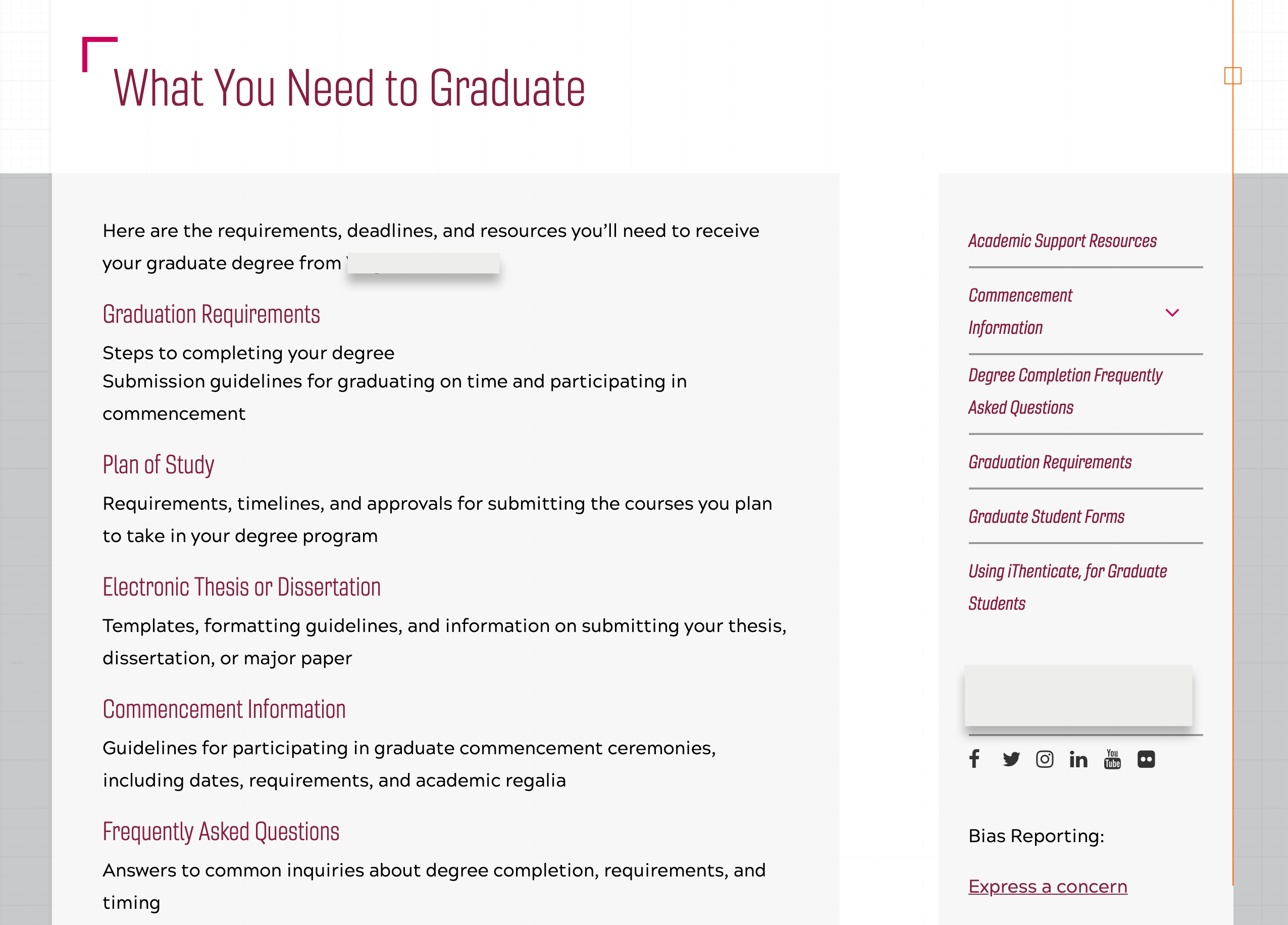
 This page of text with in-paragraph links to applications and three course pages was really just a routing page and a call-to-action in disguise. It just needed to be reformatted into more appropriately styled components, to bring out the interactions users can make with the different pieces of content.
Leave your brand color out of it
Many websites use the brand color for their link color. And why not? It’s all over the place already, right?
That’s why not. You can solve a lot of problems by making your link color something that fits your brand but isn’t a main brand color. That’s because you will want to use those brand colors for other things — heading text, for example, or other graphics. If you use that for your link color as well, people will think anything that color should also be a link. You have a color contrast problem again.
 Are these section headers links or just colored text? What about the page title, or the links in the sidebar menu? We’re not sure either.
“Distracting links” are not a design problem
Links are an editorial tool of hypertext, intended to help communicate your message and guide your reader. You should treat a distracting link the same way you would treat an intrusive or distracting sentence in your writing — by getting it out of there. Designing it away by making links less visible or less intrusive disguises bad editing and makes the site even more frustrating to all of your users, even those without disabilities.
If your page is full of links that people find confusing or distracting, and if the only design solution is to make those links harder to see, what you have is a content problem. You need to think carefully about your linking strategy, use your editorial judgement to build only the links that are necessary, and make sure the link text always supports the goals of the page you are trying to write.
The links that you keep — the ones that serve to present your information in a structure that guides your readers — need to be there, loud and proud.