

"As a valued partner, NewCity has played a pivotal role in Oklahoma State University’s journey toward greater brand awareness and unprecedented enrollment growth."

Erin Petrotta
Chief Marketing Officer, Oklahoma State University


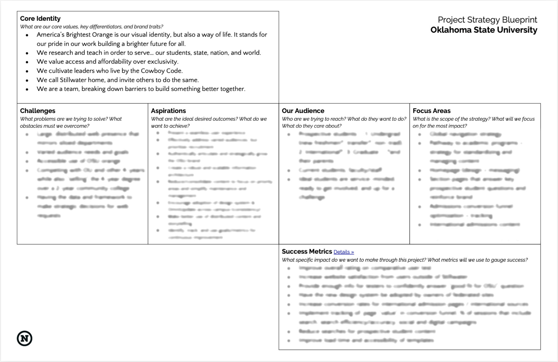
The NewCity (training) curriculum, tailored specifically for OSU audiences and rooted in our unique research, remains a cornerstone of our web presence. It has provided a framework that has been easy to evolve as our university branding strategies have changed and developed.
NewCity has been a key factor in OSU’s recent successes, and we consider them not only as partners but as friends.”
Erin Petrotta
Chief Marketing Officer, OSU