

What is a design system?
A design system is more than a set of templates used to build a website. It’s a toolbox that organizes the common parts of a site, like buttons and headers, so they can be easily reused by technical and non-technical users. It systemizes how, when, where, and why design elements are used in your branding.
A design system is a complete set of standards intended to manage design at scale using reusable components and patterns.
– Nielsen Norman Group “Design Systems 101”
This systemization makes it easier to deliver a consistent, unified brand experience for your users. It increases scalability and accessibility by creating a strong foundation to build your site and improve development and deployment timelines by leveraging modular building blocks.
Design System Benefits
- Consistency: a design system establishes a unified look and feel across all touchpoints
- Efficiency: expedites your design and development processes and provides a pre-designed component list, selection and guidelines, saving time and resources.
- Scalability: as a university grows or an organization shifts, a design system makes it easier to scale design and development efforts while maintaining coherence.
- Ease of Use: empowers your web design team members to create pages with the system without a detailed knowledge of the programming or code involved.
- Cross Team Collaboration: facilitates the collaboration between developers, designers, other agencies and departments and fosters a shared understanding of your design principles.
- Accessibility: we build components with accessible standards, test them, and use best practice, ensuring that the components can be used by a wide range of web users
- Maintenance: it simplifies maintenance efforts. Any changes made to the design system will automatically propagate to all your instances.
But design systems are only as effective as the users interacting with them. That’s where storefronts come into play.
Learn more about developing design systems in your CMS
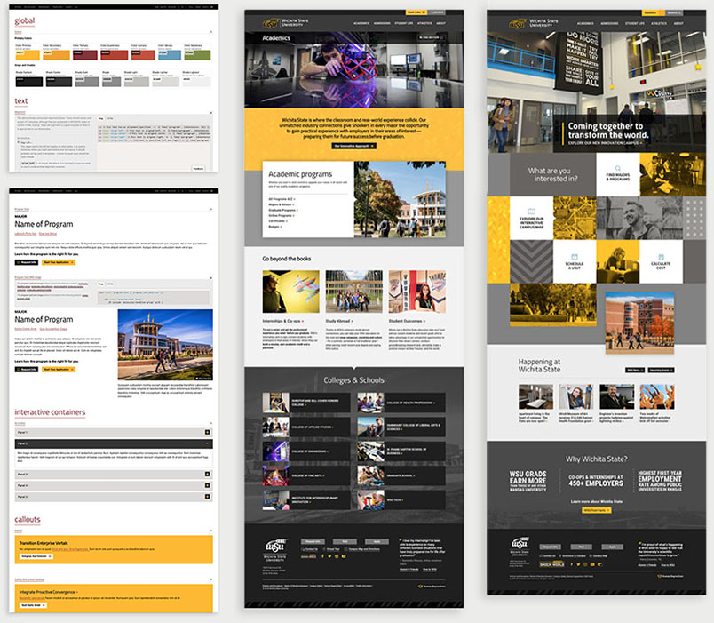
Read how OSU and Wichita State used their CMS to build component libraries that their editors turned into captivating websites for their faculty, students, alumni, and donors.
What is a storefront?
Storefronts solve the problem of how to communicate, present, and “display” your design system to editors who build with the components and other stakeholders.
If you’ve ever built a website with WordPress, you’re probably familiar with the WordPress Pattern Dictionary. When we say build yourself a storefront, this is exactly what we mean.
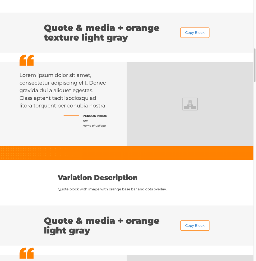
Just like how WordPress shows off their own block components in the Pattern Dictionary, you can build your own storefront that displays your components, your custom blocks, and your page layouts as a component library where your users can explore what’s available to them, discover new variations they might not have known about, and copy-paste directly into their pages.
Why should I prioritize a storefront for my design system?
Storefronts are one of the best tools in your arsenal for educating and empowering your users about your design system.
Improves development and delivery times
Storefronts give users instant access to components your developers have already tested in your environment. Even more conveniently, your storefront lets editors copy and paste components directly into their draft pages. So your brand experience stays consistent no matter who is building each page, even as you scale your site to meet growing organizational needs.
Creates better communication among stakeholders
Storefronts also capture critical accessibility and compatibility documentation your editors need as they build pages. For other stakeholders, your storefront is a single source of truth for timelines, roadmaps, and version history for all your components.
3 Steps to Building Your Storefront in WordPress
While you can use separate tools for your back room workshop and editor-facing storefront, WordPress makes it possible to use one tool for both.
At NewCity we’ve used Figma, Pattern Lab, and Storybook as our workshop for years. Recently, we added WordPress to that mix for projects where it makes more sense to build the components and host the storefront in a single platform.
Using Gutenberg—the default block-based WordPress editor—you can build your components and your storefront inside WordPress itself. Using WordPress core features like variations, nesting patterns and custom blocks, build and display block patterns that make it simple for editors to understand, discover, and use your components.
1. Analyze your current state
When building your design system, audit your old or current design systems to identify sticking points. Start by asking yourself three questions:
- Do we need to update any of our components to meet new requirements?
- What are user or component pain points we should address?
- Are our components being used as we originally intended?
Standard practices change over time, sometimes due to industry evolutions or platforms themselves. Keeping components updated with the latest requirements and conforming to the newest standards means better longevity and ranking potential.
You should also always keep tabs on how people use your components. If end users struggle to find the information they need to continue browsing or convert on an action, figure out why. No component can be everything for every use case, but you should find ways to fine-tune your components to better serve your end users and editors.
2. Collect your content
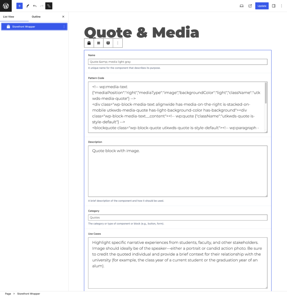
Once your audit is done, it’s time to get organized. Name and categorize your components with simple, non-technical words or phrases that content editors will understand. Don’t forget to add context with meta fields.
Meta fields should help your editors search for components and understand how and when they can be used. More information is always better in these scenarios, so don’t be afraid to include a lot (though we’d recommend keeping the jargon to a minimum).
The most common meta fields you’ll need to fill out are:
- Use cases
- Use cases to avoid
- Variations
- Dependencies
- Accessibility
- Browser compatibility
At first glance, it’s hard to see how a component can be used for multiple purposes. Offering up potential use cases (and use cases to avoid at all costs) can be helpful for editors or developers just getting started with your design system.
The more technical users are going to look for the accessibility and compatibility notes to make sure their components serve their audiences the best possible experience.
3. Define your site structure
Your editors aren’t mind readers. You have to present your components to them in a way that’s easy for them to navigate and understand what’s being offered to them. Which is why your storefront should have at least three main sections:
- An introduction to how the design system and storefront works
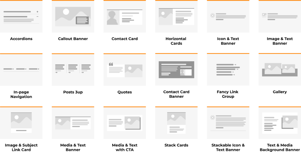
- A component library that allows editors to copy and paste existing blocks into their pages
- Pre-made layouts for pages that are going to be used over and over again
This information can be laid out however you want and over as many pages as you want, but the goal should always be simplicity. You want your editors to get excited about cruising your component libraries for the perfect addition to their pages.