
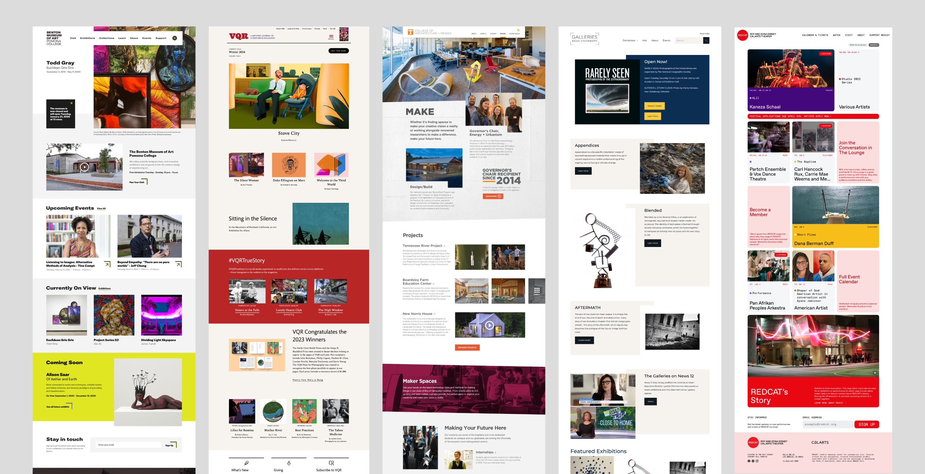
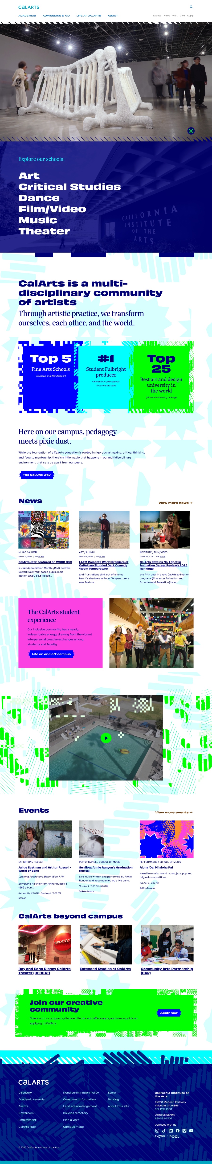
Now that our students and faculty have seen the site, we have people coming to us with new ideas for content, or interesting ways to share the creative work of their programs. I had hoped the new site would encourage people across our campus to partner with us once they saw how dynamically we can now showcase their content—and it’s already happening.
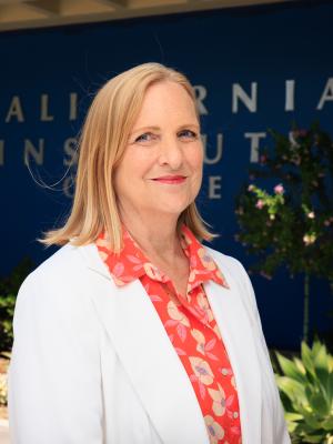
Ann Wiens
Vice President for Marketing & Communications
