As if to underscore everything above, just as we were finishing this article the CalArts website received a Gold Level Circle of Excellence Award from CASE. We couldn’t be more proud to share this honor with CalArts and Handbuilt Studio.
Some projects stay with you. Not just because they’re ambitious or high-profile, but because they rewire how you think about the work itself. They reveal that even your most carefully honed process can be transformed by the right kind of disruption.
The CalArts redesign was exactly this kind of project.
Every complex institutional project has its share of twists and turns. But this one came with an unexpected collaboration that reshaped our approach, and reminded me just how much authentic brand fluency relies on partnership.
And that fluency matters. After years of higher ed work (and a lovingly hoarded cache of design inspiration), I’ve seen that art and design schools almost never struggle to find their story. Their real challenge? Translating that story into digital without flattening what makes it distinctive.
That challenge becomes particularly complex with an institution like CalArts, six fiercely independent schools, each with distinct priorities and creative logic of their own. You don’t create a unified vision for that kind of complexity by simplifying it. You have to meet it where it lives and work with it. On its own terms.
And that’s where the fundamental questions shift:
How do you build a design system that reflects an institution’s identity, not just its brand?
How do you build structure around a culture that instinctively resists it, without compromising what it’s there to preserve?
Navigating these kinds of tensions takes an adaptive approach. UX, content, design, and development all moving together, each focused on a different facet of the same evolving challenges.
But getting internal teams aligned was only the beginning. The real work, the insight that would define everything, had to come from the people who live CalArts every day. Prospective students and families navigating their creative futures. Faculty balancing their own artistic practice with the responsibility of getting students to develop theirs. Staff managing the daily complexities of an institution that defies easy categorization.
This is what human-centered design looks like in practice. Not a methodology you apply, but a mindset of curiosity and care that keeps what you make grounded in who it’s for and what matters to them. It’s at the core of all we do. A familiar lift that brings new, nuanced challenges every time.
What we didn’t expect was how naturally that process would open up something even deeper. A collaboration that would bring the kind of clarity that takes weeks to uncover. Not surface-level understanding, but genuine insight that didn’t need to be extracted or explained.
Proof that sometimes the best answers come from tuning in — not taking over.
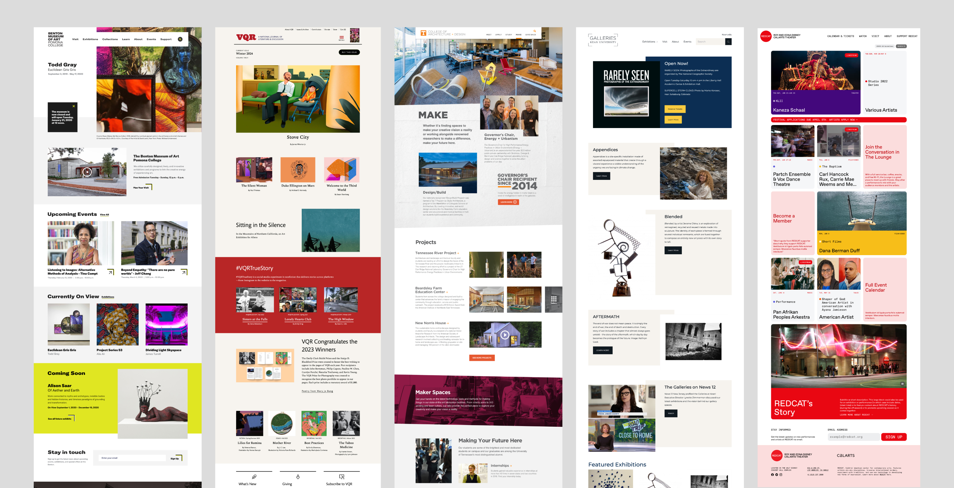
We’ve started projects with little more than a folder of meh-res imagery, a flattened logo or two, a viewbook, and a call with a client-side designer juggling priorities in real time. We’ve also worked with brand systems polished to the last kerning pair, but offering little more than a handful of hex codes when it comes to anything usable for a web project.
CalArts didn’t occupy either extreme. It was something altogether different.
Sure, I rolled up with a Figma file full of early concepts and loose directions. Discovery and visual exploration are always our starting points. Element collages, style tiles, whatever the project needs. Without a formal brand system, these explorations have to do double duty and often become the visual foundation for everything.
Not long after kickoff though, it became clear that this project would follow a different course. Although they’d brought us in for our expertise, the CalArts team believed that only CalArtians were truly qualified to define how CalArts should be represented through their site.
It was a major departure from how we usually work, and while shelving those early ideas wasn’t remotely easy, once things really got started, it became obvious it was the right call for this project.
We were soon paired with Handbuilt Studio, a design practice founded by three generations of CalArts alumnae. They didn’t just know the CalArts voice — they were steeped in it.
Working with them granted us another line of direct access to the culture, language, and creative logic of CalArts. The kind of understanding that usually takes weeks to develop. This wasn’t going to be about inheriting assets and plugging them into design. We were invited into the early development of a living, evolving identity. One that we could help refine and adapt as the build took form.
Handbuilt visualized CalArts’ identity with something far more interesting and flexible than a static brand guide. It was a dynamic visual toolkit built around CalArts’ creative DNA. Layered, unconventional, and refreshingly non-linear.
It didn’t come with rigid instructions. Just creative standards and prompts to respond to. Modular elements and cues designed to be interpreted, not hyper-prescribed. Our role was to shape how these carefully crafted signature elements would work in motion, across screen sizes, in user interactions.
Where would they break, and what could they become when they did?
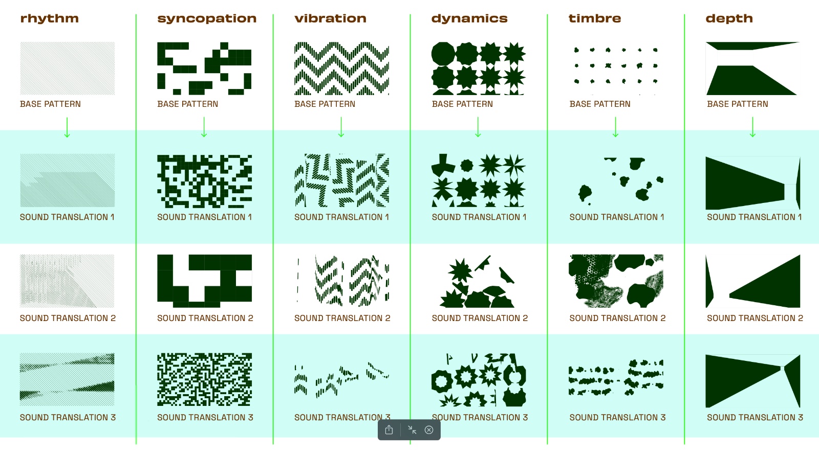
The clearest example started as a CalArts musical performance. Handbuilt ran the recorded audio through a visualization app, transforming it into thematic vector graphics: rhythm, timbre, syncopation, and more. Each capturing a different aspect of CalArts’ creative energy.
A beautiful concept with elegantly gnarly results. Our job was to put them to work. That meant defining how they would move, behave, and scale across templates, screen sizes, all while staying accessible. In other words, the usual constraints of a large institutional site.
The result was a set of go-to components that leaned hard on those visuals. Parallax page backgrounds let editors flip, rotate, and recombine a library of full-bleed SVGs to create rhythm and variation across pages. Stacked image masks added texture to teaser collections and media galleries, while a nested parallax system supported multi-layer media and color fields that merged as you scrolled, creating new forms in the process.
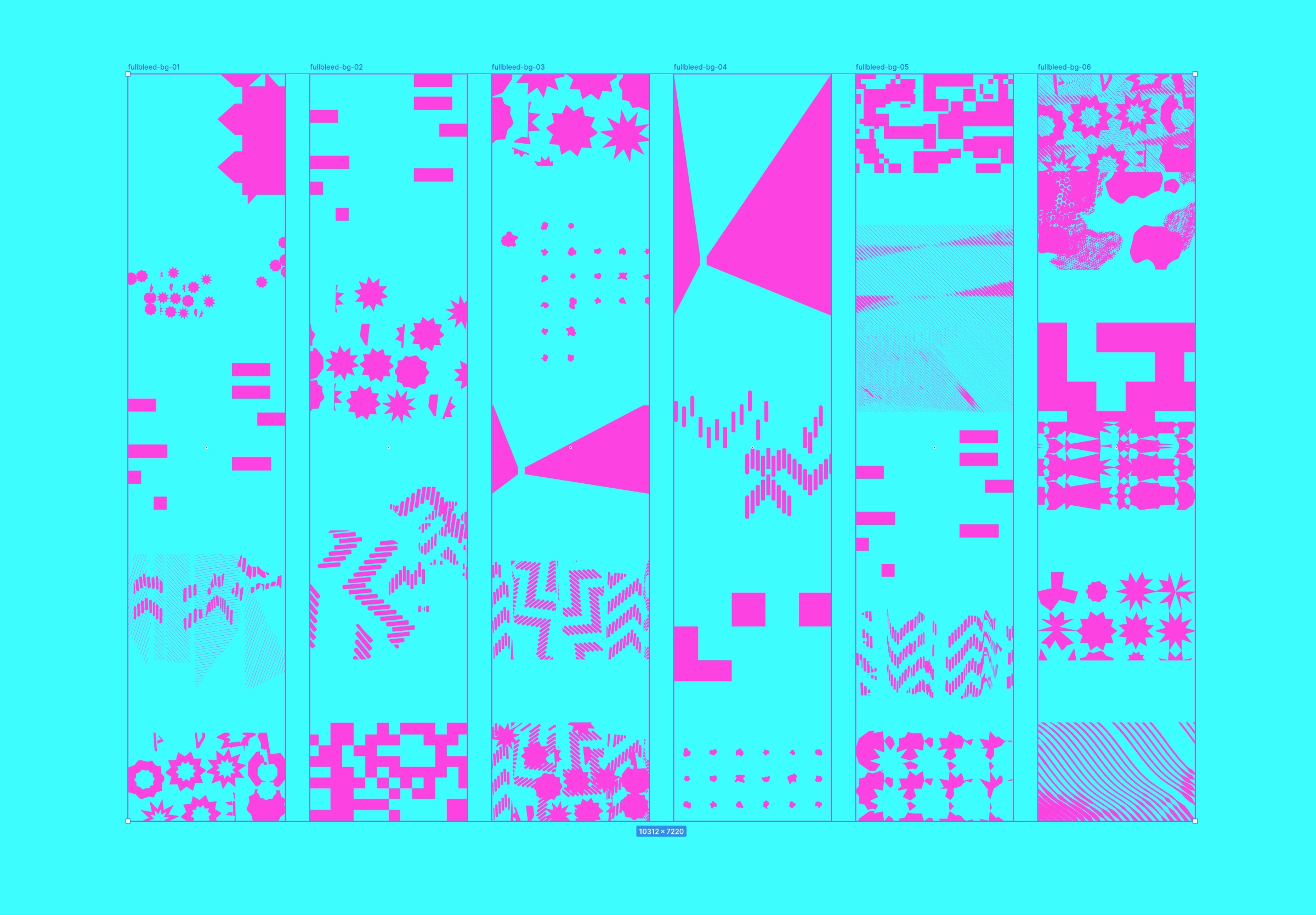
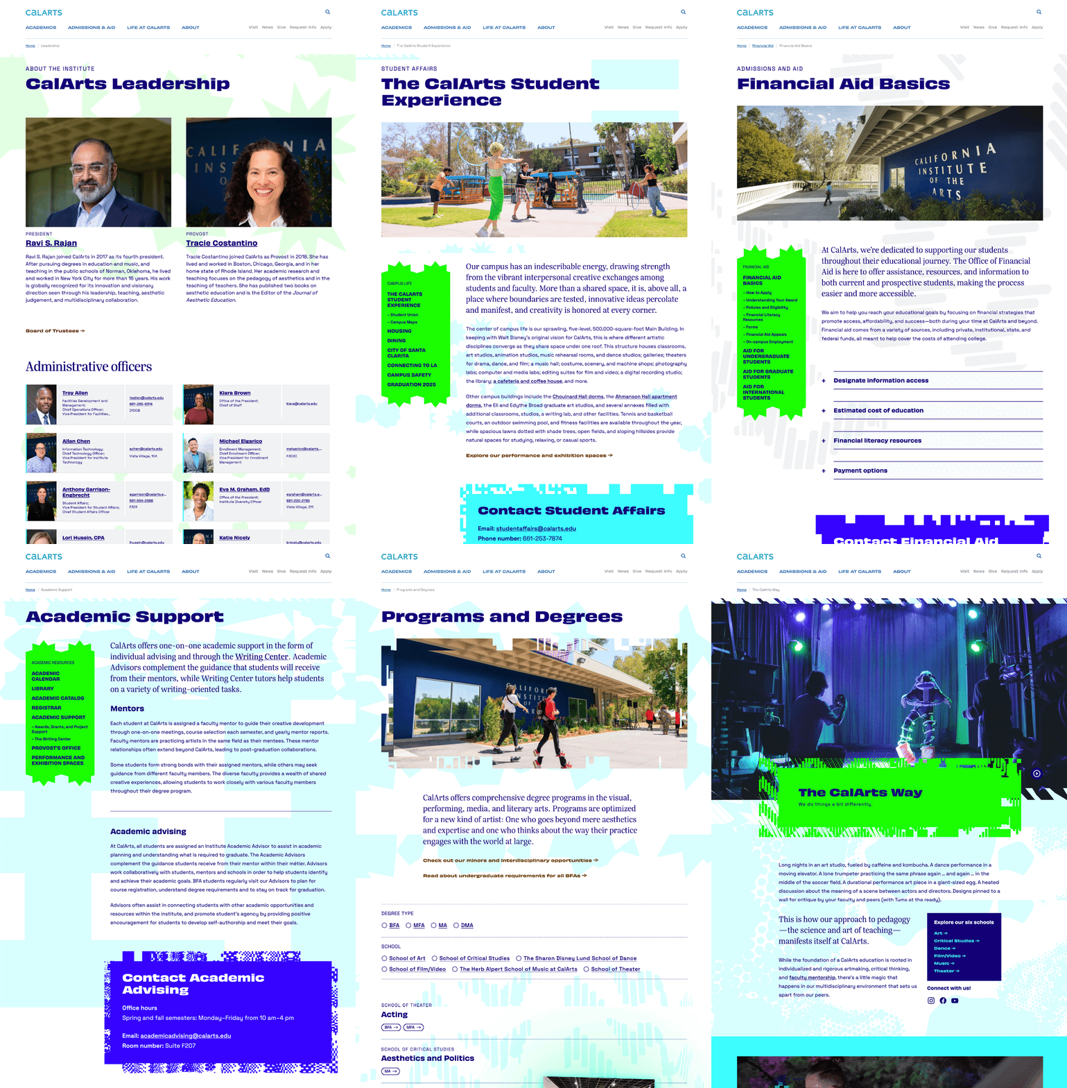
All of it engineered for content editors to assemble in Drupal, no coding required.
These implementations weren’t just decorative extras. They revealed the underlying design logic and gave editors the freedom to stretch without breaking anything. To experiment with layouts, visuals, and new compositions. Expressive elements doing architectural work, within a framework designed for portability.
The real test was whether that framework could preserve CalArts’ distinctive voice everywhere else. Handbuilt had captured CalArts in essence. Our job was to make sure it stayed that way in practice.
Starting with Handbuilt’s bold visual assets, we built a flexible system that balances institutional requirements with creative expression. The approach meets structural demands while preserving the disruptive energy at its core. Overamped without getting overloaded. Structured but still dynamic.

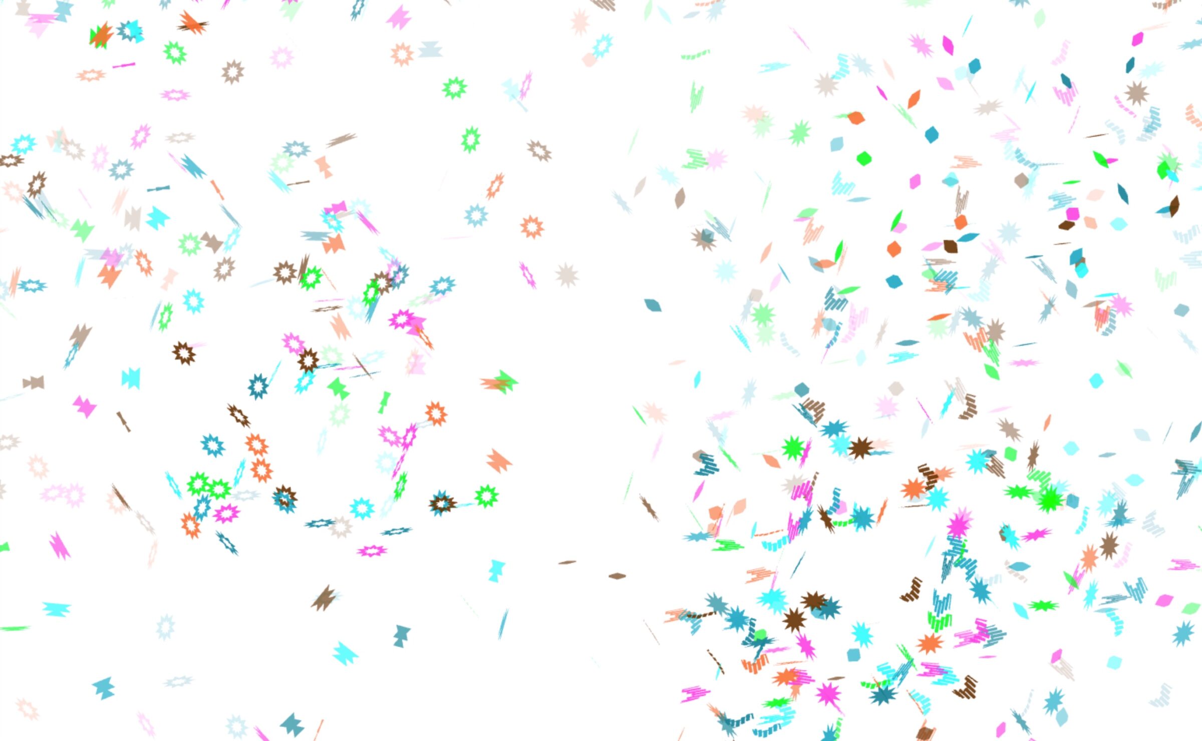
Preserving that experience across platforms became especially important in CalArts’ enrollment marketing, where identity can easily get watered down or drift toward the generic. We extended the system into Slate with custom components in email templates, UI patterns, and even a confetti animation in an acceptance email using the same visualizations. A small moment of joy that felt authentic because it used the same visual language as everything around it.
We built the CalArts system to work across media and platforms. It extended into Slate emails and communications (right) with the same visual rhythm, structure, and impact as the site.
Shared components maintain consistency, including an animated confetti explosion in acceptance emails (below) built from the same soundscape graphics used throughout the system. A small moment that connects the whole system together.

The result: a unified digital experience. One where discovering CalArts, engaging with it, and being welcomed into it all feel like one seamless journey.
The system worked because it never lost sight of its foundations. The same creative DNA at the heart of those soundscapes could just as easily burst into acceptance email confetti, and still feel unmistakably CalArts.
That continuity didn’t happen by accident. It grew from trust, shared vision, and a process designed to bring CalArts’ true expression into sharper focus. Not a top-down interpretation, but a shared understanding of who CalArts is and how it should be represented anywhere.
The strongest systems solve real problems for real people, and schools like those in AICAD need partners who understand that. We always listen deeply, adapt in real time, and design with our partners, not just for them.
What made this project different wasn’t just being involved in a brand direction still taking shape, it was the collaboration that shaped it. Together with the CalArts team and Handbuilt, we shaped a vision and built a system that could only belong to CalArts. That kind of creative partnership is rare and rewarding, and the shared discovery at its core amplified every contribution along the way.
Getting there requires real partnership. A hallmark of the engagements we love most. It means trusting the process, embracing the unexpected, and being willing to discover things you didn’t know were possible. When you come ready to work openly and think beyond what you thought you knew or expected, that’s when the magic happens.
That’s when you make something unmistakably yours — together.
As if to underscore everything above, just as we were finishing this article the CalArts website received a Gold Level Circle of Excellence Award from CASE. We couldn’t be more proud to share this honor with CalArts and Handbuilt Studio.

Rodger is NewCity’s Design Director, with 30+ years of experience shaping thoughtful, expressive design across print, digital, and identity. He balances systems and improvisation to help teams create work that’s clear, honest, and alive.
