NewCity

Cornell School of Continuing Education

Cornell University SCE was ready to rethink their entire offerings model — a shift from a catalog of programs to a filterable database of marketable products. Extensive user research and a dramatically new architecture supports both users and communicators.

Screencapture of the Cornell University School of Continuing Education home page
  • Home
  • /
  • Work
  • /
  • Cornell School of Continuing Education

Nuts &
Bolts

Timeline
May 2017 – October 2018 and ongoing services

Project Scope

  • Discovery and research
  • Information architecture, UX, and content strategy
  • New design system with front end pattern library
  • Consulting for the client’s self-implementation

CMS
Custom home-grown system implemented by SCE’s staff

Site Size
561 pages at relaunch

What do you think of when you see “continuing education"?

Professional development? Non-credit programs? Online courses?

At Cornell, it’s all those and a few more, which is where their UX problem began.

Cornell’s School of Continuing Education and Summer Sessions (SCE) offers programs for high schoolers, courses for summer and winter breaks, youth summer camps, and faculty-led “education vacations.”

Each had its own microsite, duplicating administrative and admissions content. The structure didn’t support cross-marketing between programs, and the result was a sprawling site that wasn’t supporting marketing goals.

The Cornell University campus

A new site from the ground up

We helped them rethink the course catalog model and turn it on its head — organizing program types into product lines, and reimagining programs and courses as products that can be promoted, re-shuffled, and filtered. Our project gave Cornell SCE’s team targeted user insights and a strategy that empowered them to rework their code and content.

Now their marketing materials are optimized for web. Their content works as a coherent system that meets accessibility and usability standards. And their site works seamlessly across desktop, tablet, and mobile.

"You got to know our products, needs, and audience well enough to suggest we take the radical (for us) step of combining five separate sites into one new “Courses for Credit” section, which is much simpler to navigate and maintain and gives us some great cross-marketing options."
Ann Morse
Cornell SCE Executive Director

Understanding Programs at a Glance

Getting users to program pages was only part of the solution. We wanted prospective students to quickly understand the basics to help them decide if a program would be a good fit.

Now all program pages feature a “quick info” box, that answers “Who is this for? When is it? How much does it cost?” and other top user questions.

"We wanted to reimagine our approach, and working with you all gave us a much-needed fresh perspective. We appreciate that you didn’t try to sell us a ‘product’ to solve all problems, but instead gave us research, tools, techniques — all the building blocks we needed to create a great new site."
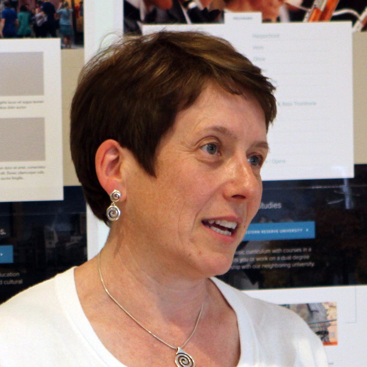
Photo of Ann Morse of Cornell
Ann Morse
Executive Director, Cornell SCE